
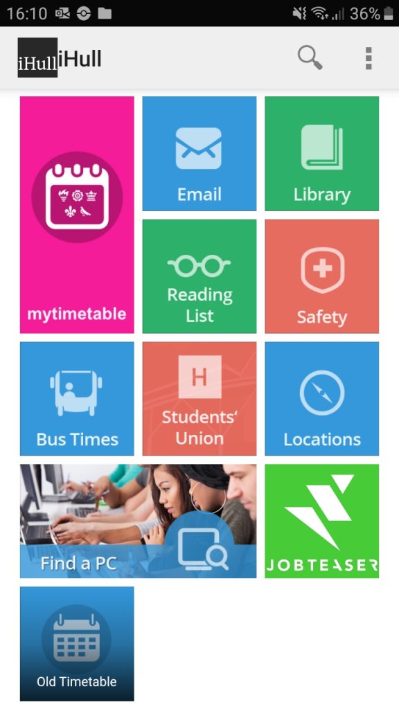
Main page 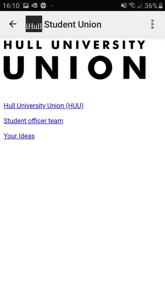
Union page 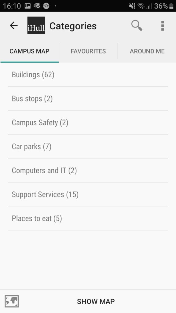
Location page 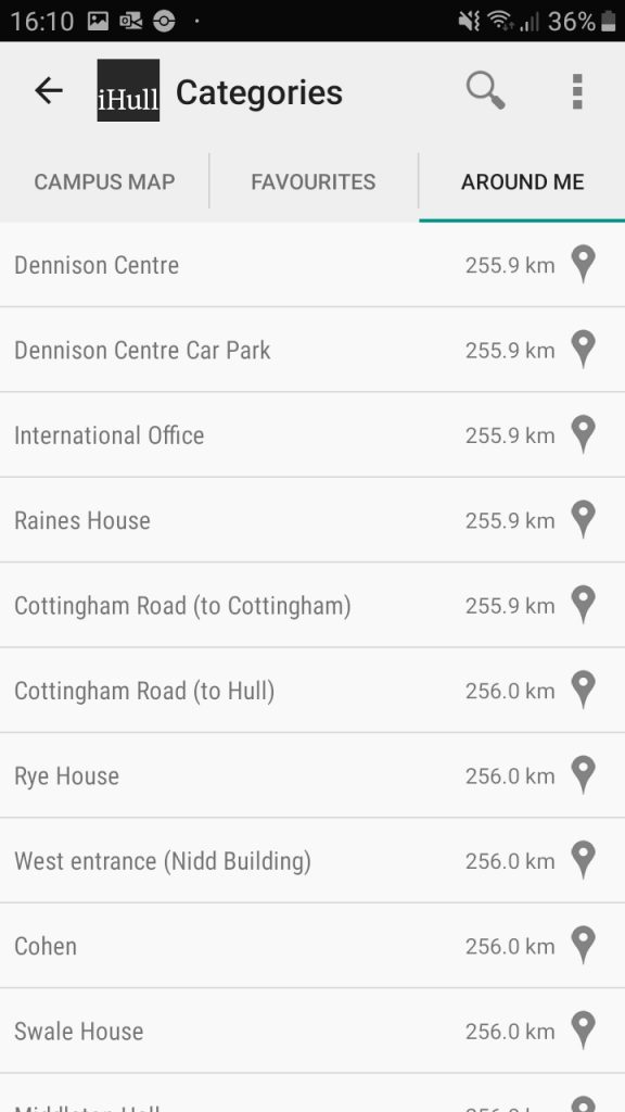
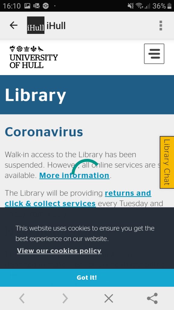
Library information page 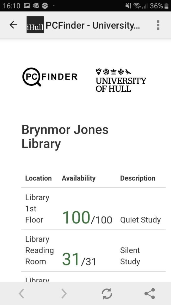
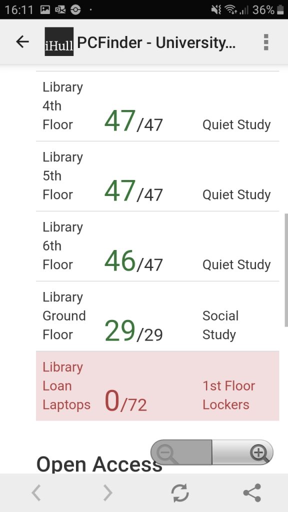
PC status page 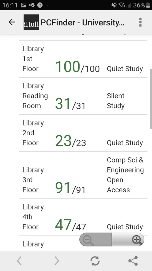

Safety page 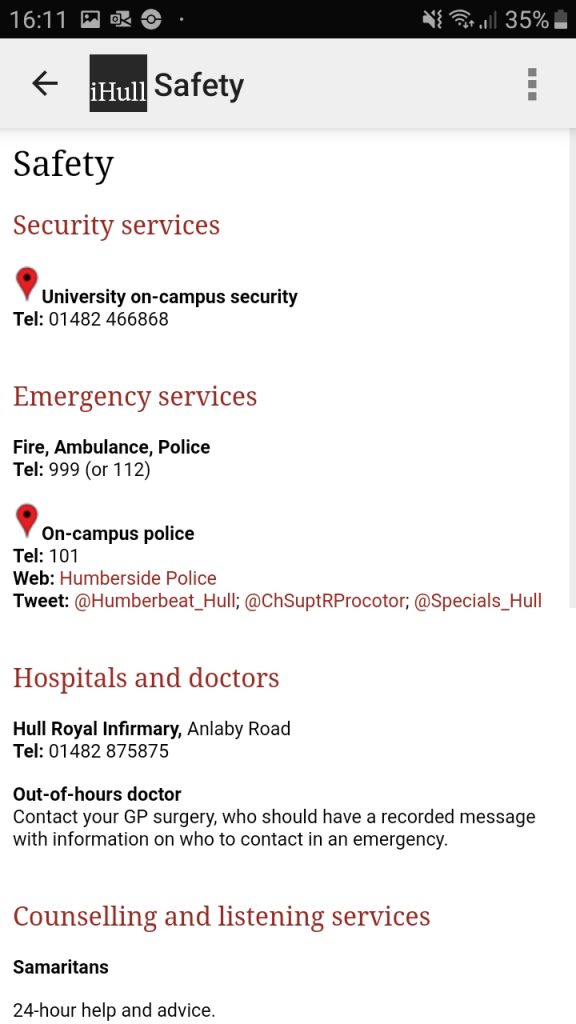
Reading list page 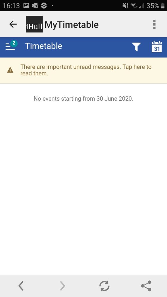
Timetable page
I believe that the current iHull app is design-wise and feature-wise; bland and boring aesthetically, very basic in features and functionality, unprofessional with its visual appearance, incomplete looking, and not suitable for people requiring specific preferences, like people with disabilities and different languages.
Starting with the main page after the user has signed in, the colours used and layout of buttons are very unappealing to look at. The layout of the panels and the menu bar along the top are also aligned very poorly, with the ‘iHull’ text being too close to the iHull logo and the text in each panel not aligned consistently with each panel’s edges. Although a pro for this page is it is very clear to see and access each service, which is perfect for newcomers to the app. I rate this page a 3/5.
Having two timetable services is very confusing, and neither of them is designed in a user-friendly manner, with a hard to navigate interface requiring the user to dig through it to find what they are looking for. This is a major problem as an easy to use and instantly functioning service is mandatory to make sure anybody can use it. I rate these pages a 2/5.
The Hull University Union page is one of the worst designed pages on the entire app, with it being just an image of a logo and three hyperlinks that take the user to an external browser. Having this instead of the information built-into the app is lazy in design and pointless as the information can be accessed through the user’s own internet browser instead. Since this shouldn’t even be classed as a functioning app page I rate it a 1/5.
The Locations page is also unappealing to use as it just consists of lots of text, but without any colour or imagery used at all. Whilst the text is informative, however, I believe images are needed to make this information easier to understand, especially at least a map should be included. I was unable to use the bus finder feature at the time on analysing this app as no bus times were displayed. I rate this page a 2/5.
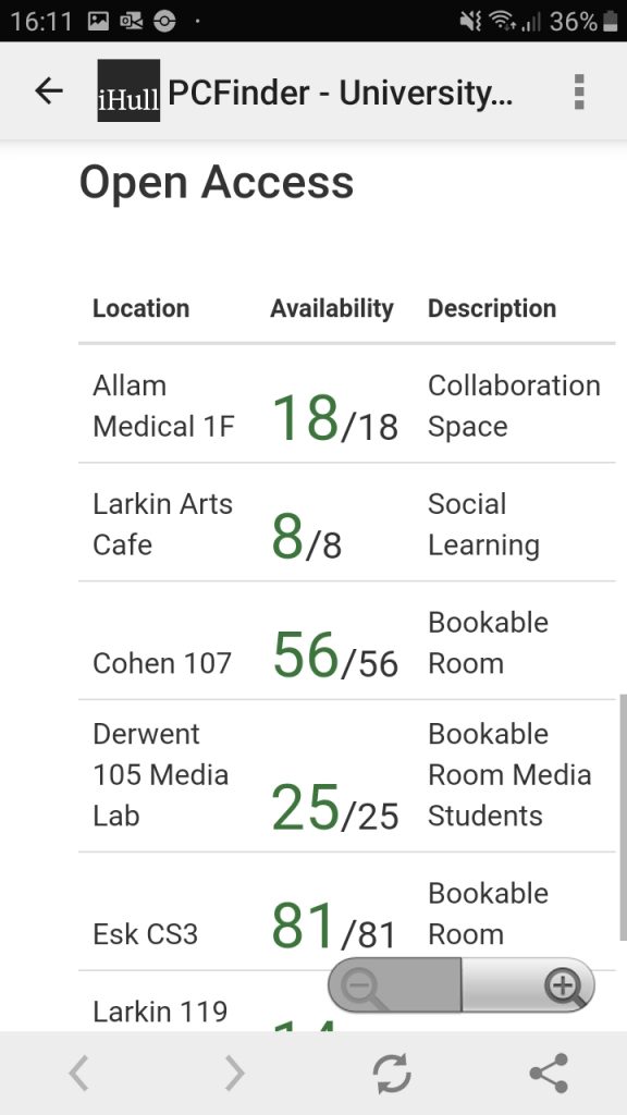
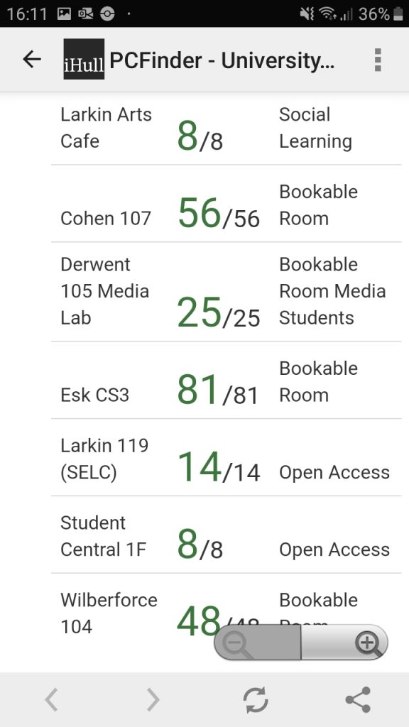
Surprisingly the PC finder page is quite useful, being straight to the point by showing the user instantly the current live status of the campus PCs and their locations, although it could benefit from additional information or features. I rate this page a 4/5.
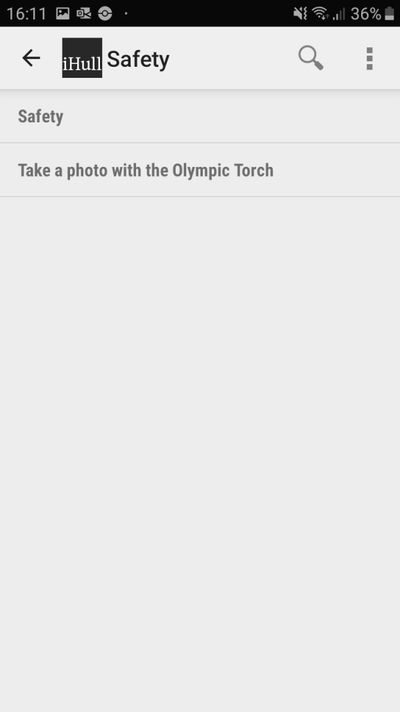
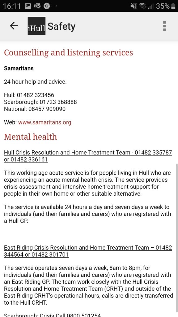
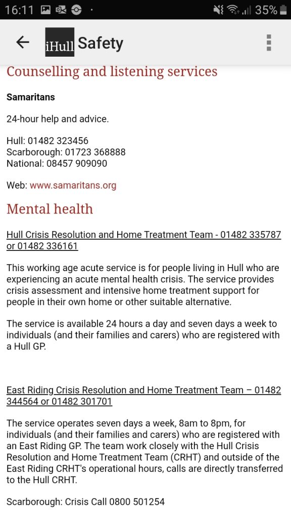
The Safety page is unprecedently rather confusing, as upon opening it the user is faced with an additional ‘Safety’ button, as well as a button that states ‘Take a photo with the Olympic Torch’. This secondary Olympic Torch page only includes an image of an Olympic Torch with text stating students can come ‘today’ to take a photograph with an Olympic Torch on campus. This page does not make any sense to be included on the safety page, instead, it should be featured on an announcements page, if the app included one. Additionally, it makes no sense how the text tells the user that this event is happening ‘today’ – what time and date are being referred to exactly? The actual secondary safety page is very informative and useful to users who need immediate help, though. I rate this page a 3/5.
The Reading Lists page did not display any text, imagery or information of any kind no matter how many times I reloaded the app. Therefore I have to rate this page a 1/5.
This app does not feature many accessibilities or help features, it can be hard to understand, it is visually unappealing and many of its features do not work whatsoever. Additional realisations I had of this app are; it’s lacking any kind of integration of digitally smart features, meaning the overall experience is very basic for the user; it is quite slow and unresponsive which can anger users who are in a rush or are impatient; and it is missing key necessary features that would make the app more worthwhile to use, like a built-in email system. Adducing this, my final rating is 16/35. This app has a lot of room for potntial, and with added functionalities, features that always work, an improved visual design and more accessability settings/options it could be a deeply beneficial app that every student would find helpful to use.