The first of Edward R. Tufte’s analytical design theories I’ll be exploring is the use of colour in the presentation and distinguishing of information variables. Tufte (1990) believes that colours should never only be chosen arbitrarily, as there needs to be a reason for those colours to exist within the designers’ visuals. Agreeing with Tufte, I believe colour is a massively important factor when creating unique and iconic media, as it complements and finalizes the accompanying visuals, expands the designer’s vision, and has the capability of conveying a message, idea or feeling that a colourless graphic could never achieve on its own. Unless the correct colours are chosen, and used in a masterful way, the design will ultimately fall flat. This mentality definitely applies to my module focus point of hyper-stylized visual media, where colour is frequently used to distinguish and contrast good and evil, the protagonists and antagonists of a story, and these character’s emotions and personalities.
‘My Little Pony: Friendship is Magic’:
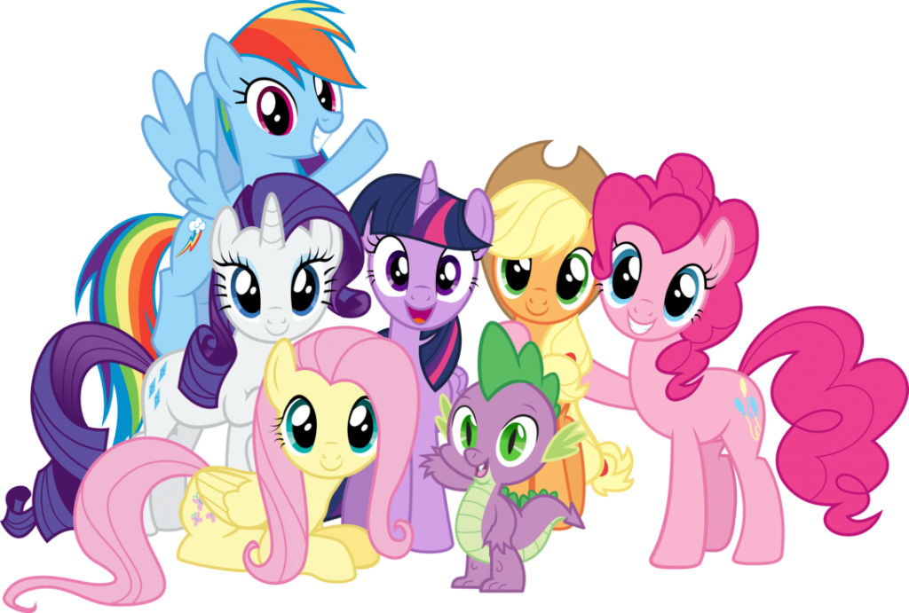
The massively successful children’s TV show and brand ‘My little Pony: Friendship is Magic’ is an excellent example of visual media that demonstrates this theory. All the protagonists of this show are aesthetically pleasing with their bright, light and vivid colour schemes, chosen to show they are characters with good intentions. As a group, their combined colour schemes cover every primary and secondary colour, which makes up a rainbow, and in children’s media a rainbow is commonly a symbol of happiness and innocence – two main focuses of the My Little Pony brand. Furthermore, these colours are all complementary to each other, using only a few shades of completely flat and bold colours with very limited shading or lighting.
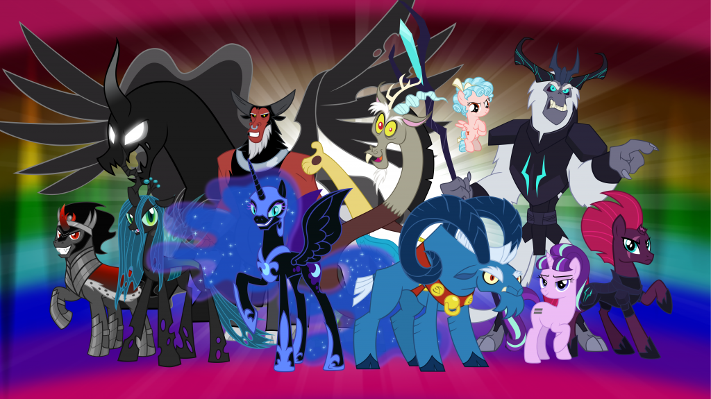
Diversely, the colour schemes of the antagonists purposefully reject the principles applied with the protagonists in order to differentiate the two. Deeper, darker and duller colours like blacks, greys, reds and blues easily demonstrate that the characters are evil or antagonistic, reflecting darkness and evil. This doesn’t always apply, however, as one character features a variety of clashing colours to express their chaotic personality, and two villains are coloured vibrantly like the protagonists to trick the audience into believing they are good, which in turn fuels their antagonism.
This show’s audience can clearly understand through the use of colour labelling which characters are protagonistic or antagonistic, which is important since the target demographic of this show is younger children (with the exception of characters that are purposefully designed with the intention of befuddling the audience for narrative purposes or comedic effect).
All of these decisions for the show’s visual style have expertly achieved simplicity and visual attractiveness, in turn constructing iconography and recognizability throughout the product and brand. This proves that Tufte’s theory is correct, and I believe without these design decisions the My Little Pony: Friendship is Magic brand would be nowhere near as popular and successful as it is today.
–
More examples of other pieces of visual media that also apply Tufte’s colour design functions for the purpose of identifying protagonists and antagonists:
- ‘Scott Pilgrim’ (graphic novel) – Bryan Lee O-Malley:
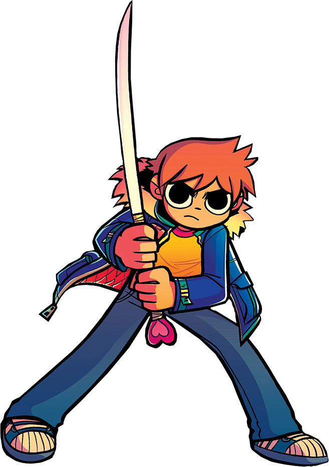
Scott Pilgrim is a character from a graphic novel series created by Bryan Lee O’Malley of the same name. In this series the character’s regular appearance utilizes a wholesome and pleasant colour palette consisting of warm oranges and blues to show the reader he isn’t a ‘real threat’, and is instead treated lightheartedly throughout his story, which perfectly encapsulates the character. On the other hand, a villainous alter-ego version of Scott Pilgrim, dubbed ‘Nega Scott’, is a separate character who’s a physical manifestation of everything regrettable Scott had done throughout his life. This is portrayed explicitly through the use of a monochrome colour scheme, which represents all of Scott’s heroic deeds and nice aspects of his personality being washed out, revealing who he truly is inside. This comparison of the two alternating colour schemes for the two versions of the character is a prime example of colour being used to label good and bad characters in media.
- ‘Super Mario’ (video game franchise) – Nintendo:
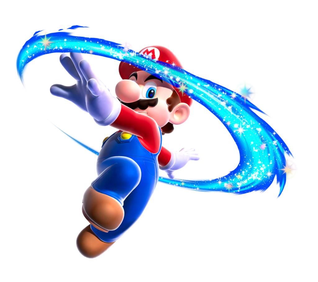
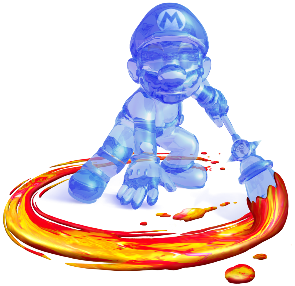
Super Mario’s use of bright red and blue for his outfit present a friendly and approachable demeanor, perfect for a family-friendly hero character, as these colours are very childlike. Additionally, the combination of red and blue distinctly demonstrate Mario’s main attributes as a hero – the red for his fiery spirit and determination, and the blue for his calm and collected personality and focus. Alternatively, as the name depicts, Shadow Mario is completely clear to show he is nothing more than the real Mario’s dark shadow. Shadow Mario uses a blue and red colour scheme (this time solely), but for a contrasting representation – his whole body is clear blue to show he is inhuman and ingenuous, and his weapon uses striking reds to elicit danger and fear in his opponents.
- ‘Splatoon’ (video game franchise) – Nintendo

In the Nintendo game Splatoon 2, two teams of four ‘Inklings’ battle for the most turf using ink-powered weapons. Whichever team coats the ground with more ink wins the match. Colour in this game is key as it defines the game’s core gameplay mechanic, being applied to the ink, characters, weapons, the environment and the competitive team vs team concept. Here, colour is still used to differentiate between the protagonists and antagonists of the game, except these are not inherently used to state the characters are necessarily ‘good’ or ‘evil’, instead just the players in the player’s team in comparison to their opponents, with everybody being treated as characters with no evil intention story-wise.

Splatoon 2’s map also perfectly illustrates Tufte’s theory, as colours are used here to quickly tell the player crucial information that needs to be accessed immediately during a high-energy online match. Everything that relates to you and your team is displayed in the same colour of the ink you have been assigned at the beginning of the match (in this screenshot’s case being orange), and everything relating to the enemy is displayed in the colour that was assigned to their team (purple), clearly differentiating everything important to the player for their match. This includes; player icons, button icons, ink coverage, the opponent’s weapons (as seen in the top-right corner), the cursor and usable items. What’s more, only complementary colours are used in these matches, like purple and orange, pink and green, and yellow and dark blue, to make it easily distinguishable for the player.
References:
Tufte. E.R., 1990. Envisioning Information. Cheshire, Connecticut: Graphics Press. (pp. 81-93)
Figure 1: Hasbro (2010) MLP Friendship is Magic Group Shot [Promotional artwork]. Available online: https://poohadventures.fandom.com/wiki/The_Mane_6?file=MLP_Friendship_is_Magic_Group_Shot.png [Accessed: 03/11/2021]
Figure 2: AndoAnimalia (2020) The Villains of My Little Pony [Fan art]. Available online: https://www.deviantart.com/andoanimalia/art/The-Villains-of-My-Little-Pony-830080065 [Accessed: 03/11/2021]
Figure 3: Bryan Lee O’Malley (2010) Ramona Flowers Scott Pilgrim Comics Character [Promotional artwork]. Available online: https://favpng.com/png_view/ramona-flowers-scott-pilgrim-comics-character-png/sNRZd0ZM [Accessed: 03/11/2021]
Figure 4: Bryan Lee O’Malley (2010) Nega Scott [Promotional artwork]. Available online: https://www.pinterest.co.uk/pin/325596248060024626/ [Accessed: 03/11/2021]
Figure 5: Nintendo (2007) Super Mario Galaxy [Promotional artwork]. Available online: https://favpng.com/png_view/mario-bros-super-mario-galaxy-2-mario-bros-super-mario-odyssey-png/x8y8DSKQ# [Accessed: 03/11/2021]
Figure 6: Nintendo (2002) Shadow Mario artwork [Promotional artwork]. Available online: https://www.mariowiki.com/Shadow_Mario [Accessed: 03/11/2021]
Figure 7: Nintendo (2017) Sturgeon Shipyard [Video game screenshot]. Available online: https://mms.businesswire.com/media/20170706005372/en/597656/5/Splatoon2_Sturgeon_Shipyard_01.jpg?download=1 [Accessed: 09/11/2021]
Figure 8: Nintendo (2017) Splatoon 2 Map [Video game screenshot]. Available online: https://www.imore.com/how-get-started-playing-splatoon-2-handy-tips-and-tricks-beginners [Accessed: 10/11/2021]