The forefront of my Design Research Diary exploring Tufte’s ‘Envisioning Information’ visual design principles is modern hyper-stylised and graphically exaggerated visual design for entertainment and commercialistic purposes. This includes the likes of illustration, graphic novels, animation for television and film, comics, graphic design, video games and other audio-visual productions created to be viewed/experienced by an audience. My creative campaign shares the same focus but is directed specifically towards video game concept design, subsuming a variety of original approaches to the many aspects of creating a piece of interactive media consumed by adults and children alike.
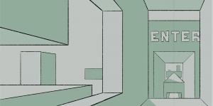
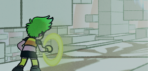
Tufte’s principles are critically important in relation to video game design, which requires thought and intricacy to produce masterfully and artistic interactive experiences, likewise with other visual design mediums. Throughout my creative campaign, I will be demonstrating how each of his theories impacts the creative processes of designing the visual side of my theoretical video game. Ideas, themes and original graphics, which incorporate Tufte’s design principles presented throughout this campaign, will be united in a final piece of graphical work – a piece of concept art of the game’s visual presentation (what the player will see whilst playing).
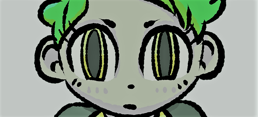
Below are my illustrated pieces of concept/reference art of the game’s protagonist and antagonist, demonstrating Tufte’s first theory, the use of colour in visual design. In my Design Research Diary, I explored how colour is used to label and distinguish a character’s traits, for instance, whether they are ‘good’ or ‘evil’, the kind of environment they reside in, and their narrative related background. Colour themes, lighting and harmonies can all crucially impact how something or someone is perceived, especially in character design. I have applied this ideology to these original characters to clearly communicate how they are intended to be perceived by the viewer.
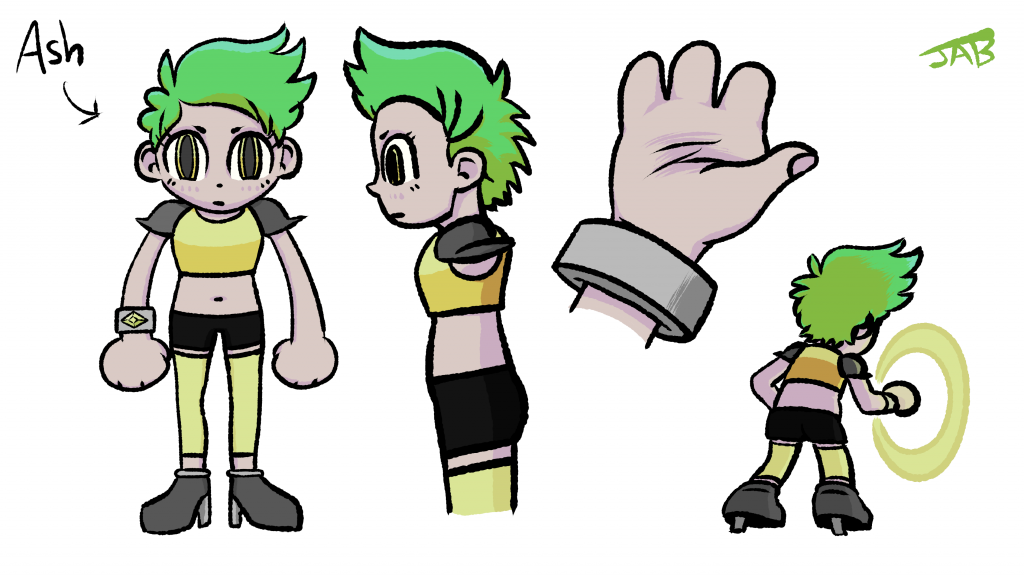
Ash is the game’s protagonist and primarily features yellows and greens throughout their design – colours that are used to express happiness, nature and warmth, reflecting that they are ‘good’ and trustworthy like a protagonist ‘should be’. Shades of grey are used for certain aspects of Ash’s armour to show that the material used is tough and durable enough for a hero to use when saving the day, complementing the sturdy shapes present in the armour’s design. However, one will notice how I’ve used cold and somewhat dull tones as opposed to warmth, which is most commonly used in protagonist design. This is a deliberate design decision of mine as cold hues reflect the artificiality and bleakness in the character’s world, their own mind and thoughts, their physical construction and their entire existence in the game’s plot. Ash is not a human character and the world they reside in is nothing like our own, so the way they think will not be intensive, emotional or passionate like a human. This in itself has a deeper meaning, representing how a playable character in a video game could never think or feel like a human or in-world NPC (non-playable character) would, as free will, decision making, interaction and external communication are restricted to what the player chooses. Ash has the physical appearance of a human, but inside they are cold and mute, thus reflecting the colour scheme.
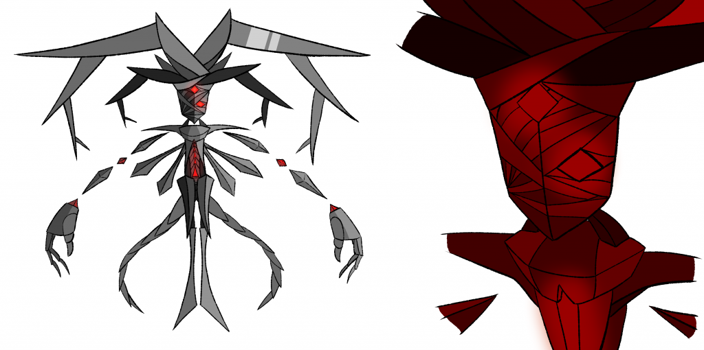
For my antagonist ‘Magmortem DX’, I used shades of dark grey throughout his design to; show how sturdy and durable his armour is (like Ash’s), demonstrate how heavy and robust his body is juxtaposed to his environment, create the illusion that the material is shiny or metallic (reflecting the multitude of light-emitting sources in the game’s world), and to show that he is evil, as darker colours are commonly used to portray villainous characters. Red heat shining through his two ‘eye’ sockets and the cavity in his torso associate his character with themes of evil, darkness and villainy, as it resonates with darker, sinister and upsetting themes such as hell, demonic entities, blood and gore, emergency and urgency, medical aid, intense heat, and anger. Both red and dark grey adjacently convey the malicious nature of the antagonist.