My fourth graphic demonstrates Tufte’s theory of the use of layering and separation. With game design, the layering and separation of visuals are pivotal to achieving outstanding and clear visual presentation, so for this piece, I created a concept for a character customisation shop menu/select screen, that allows the player to purchase visual customisations with tied gameplay upgrades, in this case gloves, using the game’s fictional currency.
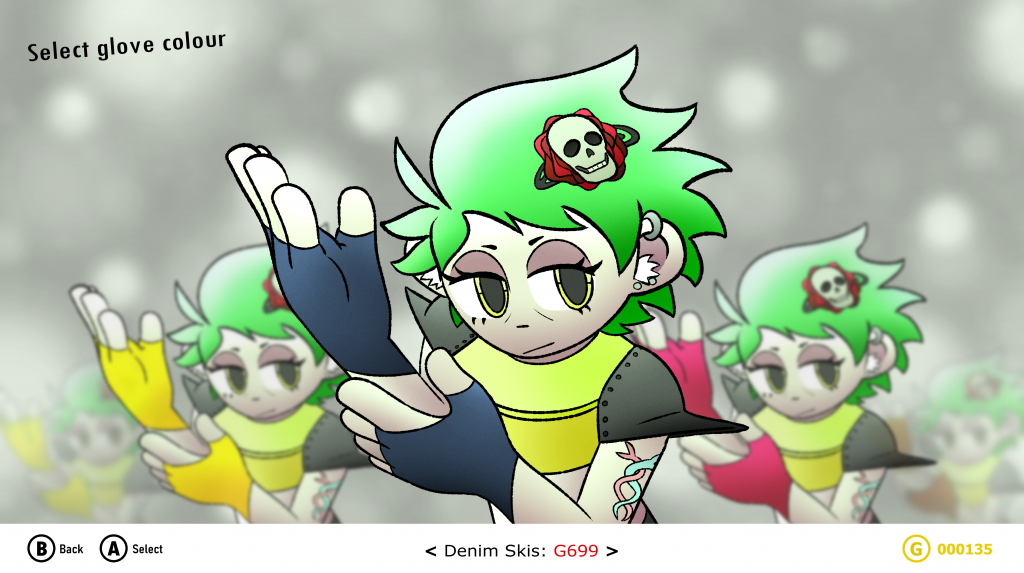
There are multiple levels of depth within this graphic. On the front layer at the bottom is the User Interface bar, layered above everything else on the screen due to its great significance. Information such as the buttons to command the game forward and backwards, descriptions, names and the in-game currency are placed onto the bar, all of which are crucial for the player to understand and see distinctly, meaning the bar needs to be at the forefront and visible at all times. At the top, there is some additional UI text on the same layer too. Behind is the main visual environment of the game, depicting multiple layered images of Ash, the protagonist, wearing different coloured gloves. Its purpose is to let the player cycle through each of the glove colour options by moving the directional pad or the joystick of the controller left or right. The current selection is displayed at the front to show that is the one the player is ‘hovering’ over, whilst the other options are more behind, to the side and further away depending on how far down the list they are in comparison to the current selection to show that they are not being ‘hovered’ over. Behind all of these is the background used to show that everything you see on screen exists three-dimensionally in-game.