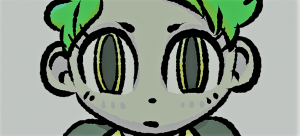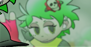
Demonstrating Tufte’s final theory of Micro-Macrocosm, I created a final piece of concept art (see below) depicting what a battle scene from the game would look like. It presents an RPG (role-playing game) style turn-based battle taking place between the playable protagonist and the main antagonist of the game in a strange sub-dimensional reality, with the user interface layered over the top. It combines the many different ideas and themes presented in all my previous graphic work into one carefully thought out and considered illustration incorporating all of Tufte’s design theories.
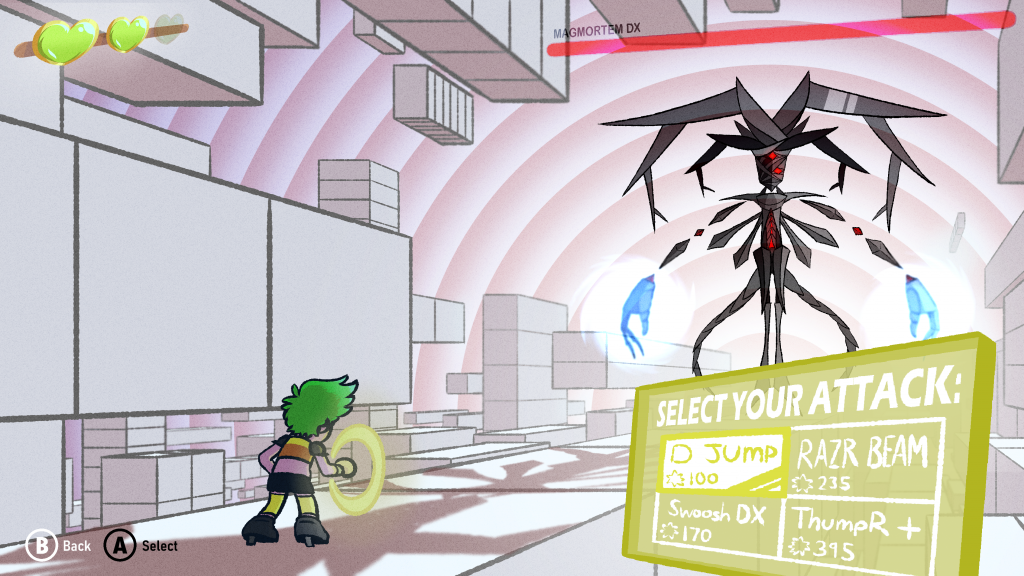
Starting with theory #1, the use of colour, I acknowledged my previously stated philosophy regarding colour schemes and baked it throughout the piece. Now both characters’ colour schemes have been applied to other new details featured in this piece, like an attack/command selection panel used to command the game to initiate attacks against the enemy coloured with Ash’s signature lime green, and the villain’s health bar floating above his head coloured bright red, both to keep with their respective theming consistency. I’ve used greys for the platforms to reflect neutrality and coldness, however, behind Magmortem DX red-ish bars of light pulsate against the neutral grey-blue background to show he has an influence on the environment around him.
For theory #2, the comparison of small multiples, I have included a large number of individual graphics that correlate with one another. Health bars/meters for both the protagonist and antagonist, a ‘Back’ action button, a ‘Select’ action button, and the aforementioned attack selection panel all come together to make the user interface; many geometric platforms float together through the air against a confusing spiral backdrop creating the world environment; and the two main characters are featured prominently and clearly together.
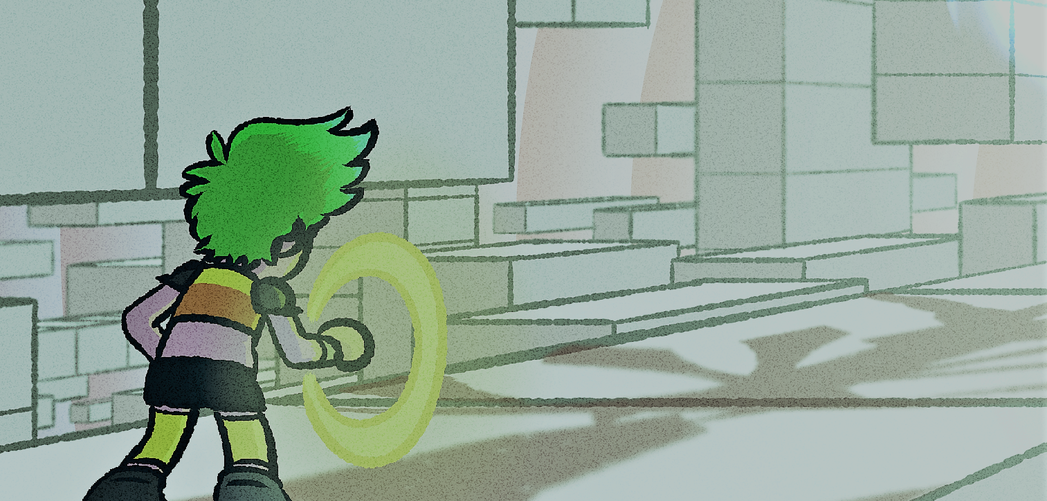
Theory #3, the use of narrative over a specific time within a specific space, is represented in this piece similar to my graphic exploring said theory, which depicted a geometric environment shown from the player’s/protagonist’s perspective and the front-facing direction it encouraged you to take. However, with this piece, I decided to reconfigure the perspective of the same geometric environment towards the villain to clearly emphasize getting to him is the goal and to encourage the player to keep pushing closer and closer to victory. The further the player travels down the path over time, the closer they get to the villain and the game’s victory.
And finally for theory #4, the use of layering and separation, I layered every visual asset to produce an eye-pleasing, comfortable and professionally designed gameplay experience with purpose. All the user interface icons appear most importantly at the forefront of the screen and are statically confined to their own individual places for clear and swift information reading. Behind are the characters layered over the background, fully visible for clarity and not partially hidden. The background itself consists of a large number of cubic platforms layered over one another to present a fully three-dimensional environment that has lots of depth. Gaussian blur used on platforms further in the background and the very back layer of red-blue rings of light further achieve a feeling of great depth, something I was very keen on including to reflect the cold empty world that both the protagonist and villain reside in that mirrors their own coldness and emptiness within themselves.
Personally, I believe that my final graphic effectively implements each theory in a way that enables each to work in correspondence with the other, creating something visually ‘epic’. Attributes that I have not touched upon previously, due to not fitting into any of the definitions of Tufte’s theories, have been created as a result of these design principles merging, creating something new. For instance, both applying the theories of colour and narrative over a specific time within a specific space, I created a feature that implements both – the pulsing circular rings of light energy emitting from behind Magmortem DX. Rings depict a sense of direction, encouraging the player to move closer and closer to the centre, even be somewhat inviting. However, with the rings being red, a colour often associated with danger and emergency, it gives the player the feeling of moving towards something dangerous, in this case, the antagonist.