After a brief discussion at the beginning of the project, we quickly agreed on producing a visual-novel style game/digital experience, with it being a fun project to produce and having lots of creative potential.
Usually when it comes to personal projects of mine I would next seek out inspiration and draw out a variety of ideas and concepts, however the theming and visual style of the project came to fruition almost instantly. Upon creating a very basic sketch to showcase our preliminary idea in our first presentation at the beginning of the project, the audience of members from other teams took a very strong liking to what we had invented, which at the time only consisted of a sketch I drew out depicting two random blob-like characters with punctuation as their faces for the intended purpose of being placeholders, standing in a field of blank with speech bubbles next to them and an incredibly barebones depiction of a UI.
I initially thought that we would need to utilise a detail-heavier approach to the visual style, in order to produce a product of ‘higher quality’. However, upon witnessing the immediate love for our characters and their apparently charming simplicity, we agreed to legitimately use the designs and instead heavily expanded on them.
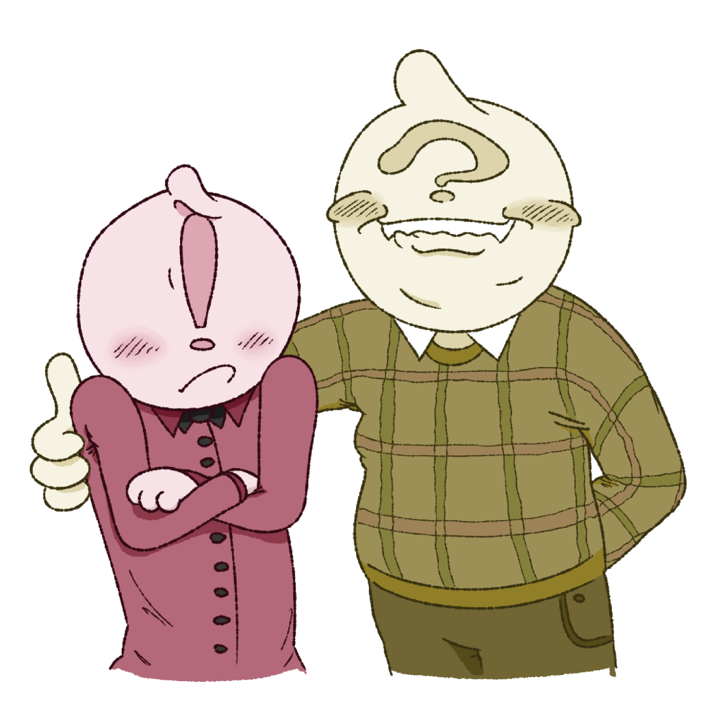
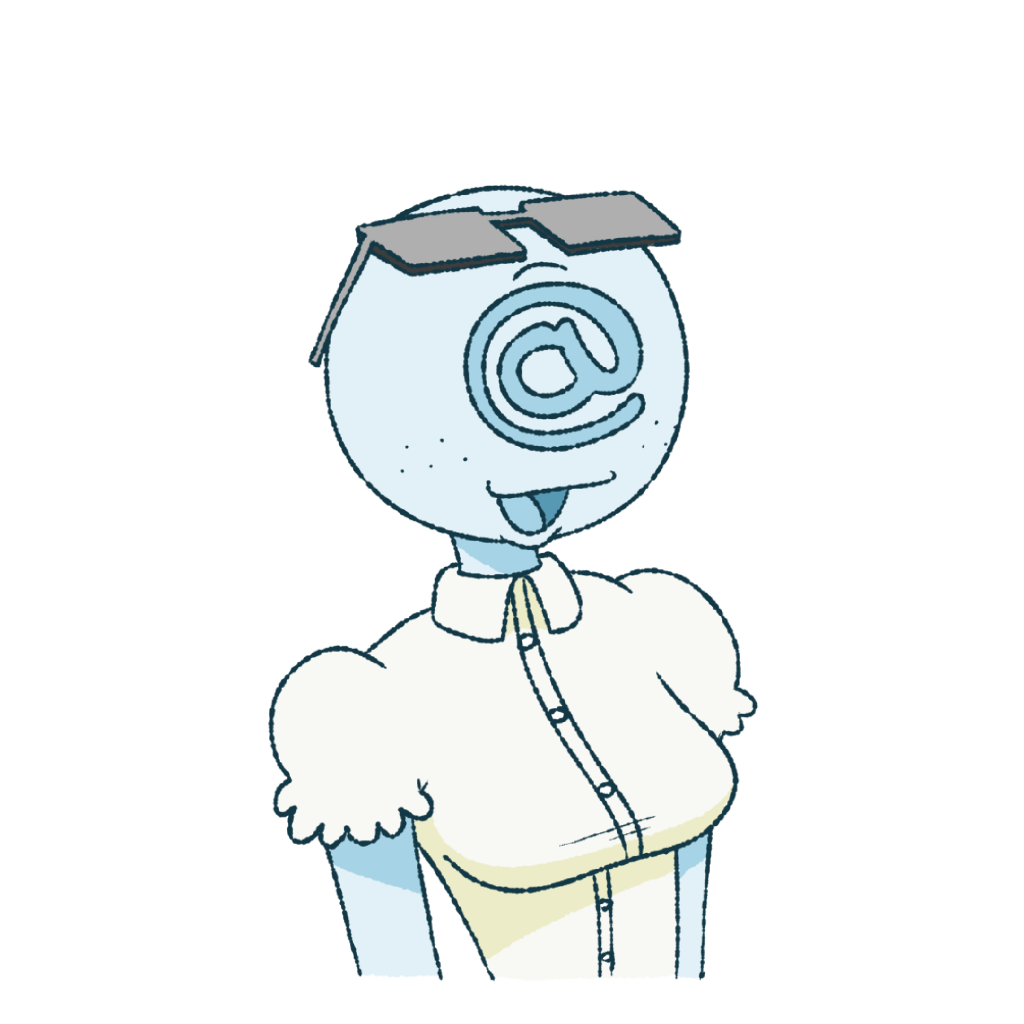
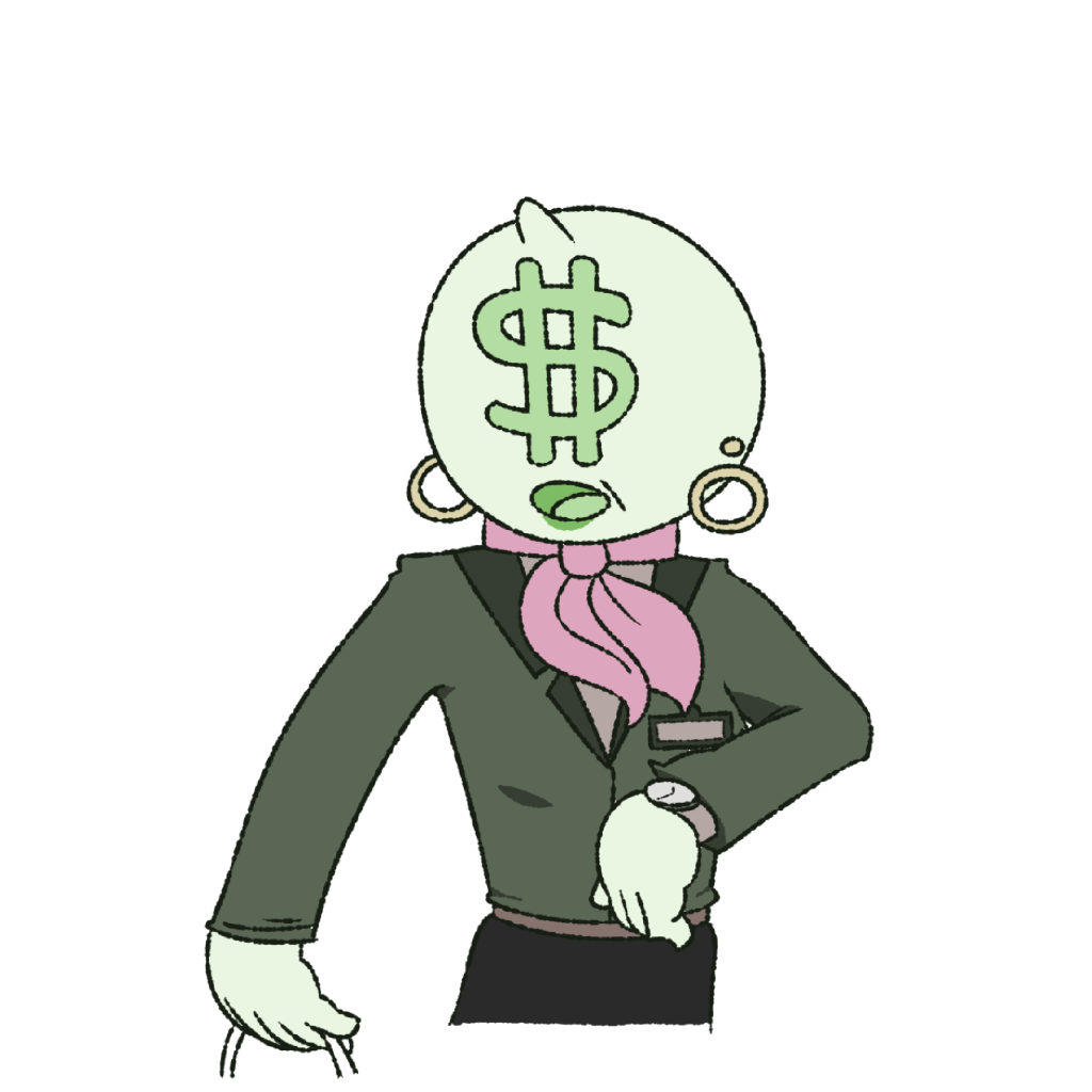
After discussions with the team and reconfiguring my placeholder characters, I created the visual-novel’s core cast; the annoying and questionable John, the angry and easily flustered Marc, the intelligent and harmonising N@tallie, and the confident and successful Donetta. These new characters inspired by the original examples have much more personality and distinguishable natures, mainly through the addition of expressions, clothing and colour schemes – you can tell what these characters are about and are much easier to imagine existing with real personalities.
From here the plot for our visual-novel came very easily. I instantly could imagine this eclectic assortment of characters as office co-workers, so I made the story about the player beginning work at a fictional company alongside symbol-clad employees. Then after designing the basic plot and the personalities of each character, Jasmine and Alex were able to continue to produce the dialogue and the UI/UX for our product, respectively. This left me to fully realise these characters and their setting, essentially brining them to life, and to create the following additional assets.
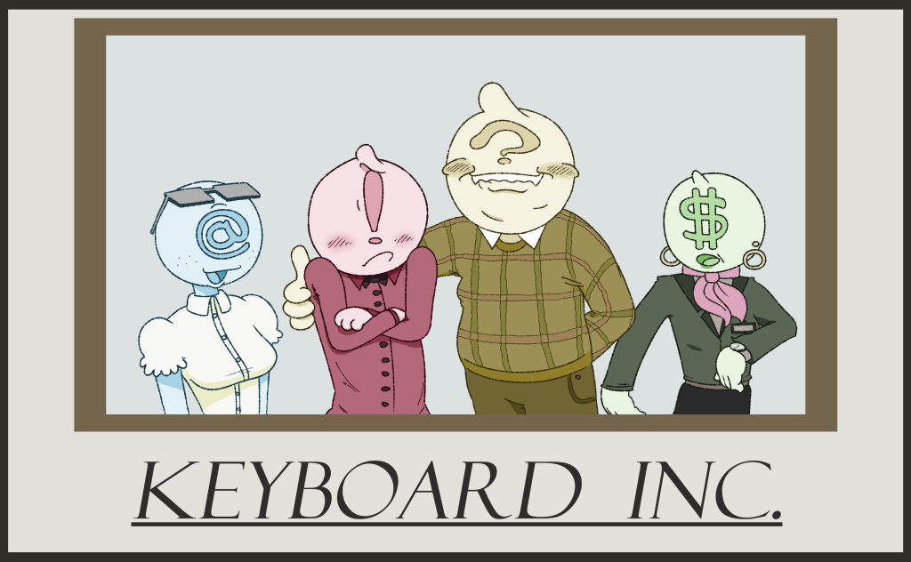
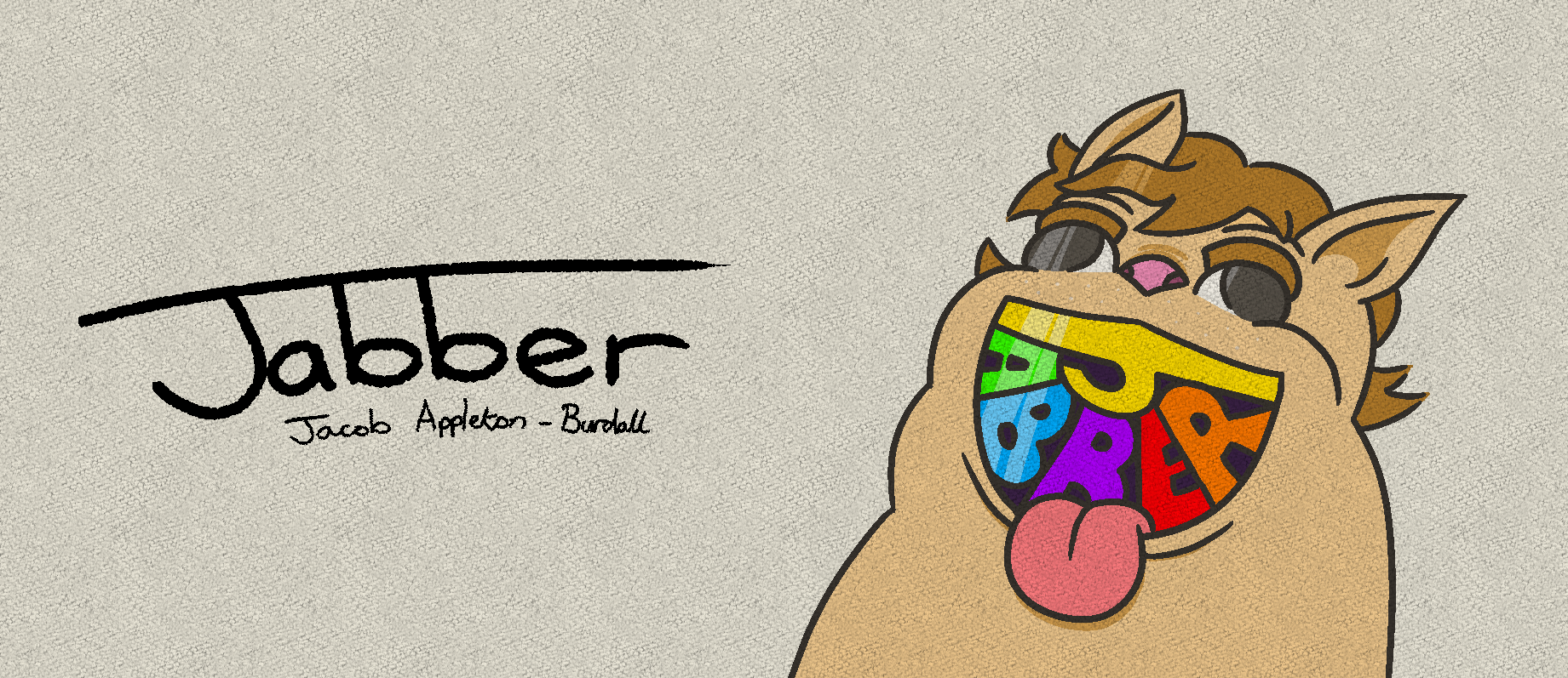
This key art was designed to be used for the intro of the interactive novel, as well as any theoretical promotional material.
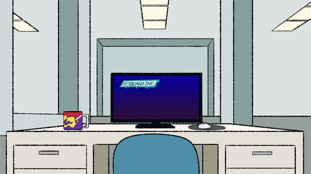
In the final production of the visual novel, the characters would be situated atop of the illustrated background of the location the story is currently taking place, in this instance behind John’s desk. Alex’s UI/UX would be incorporated into this, being placed on top of everything else to help the player understand what is happening and what they must do to advance the story.
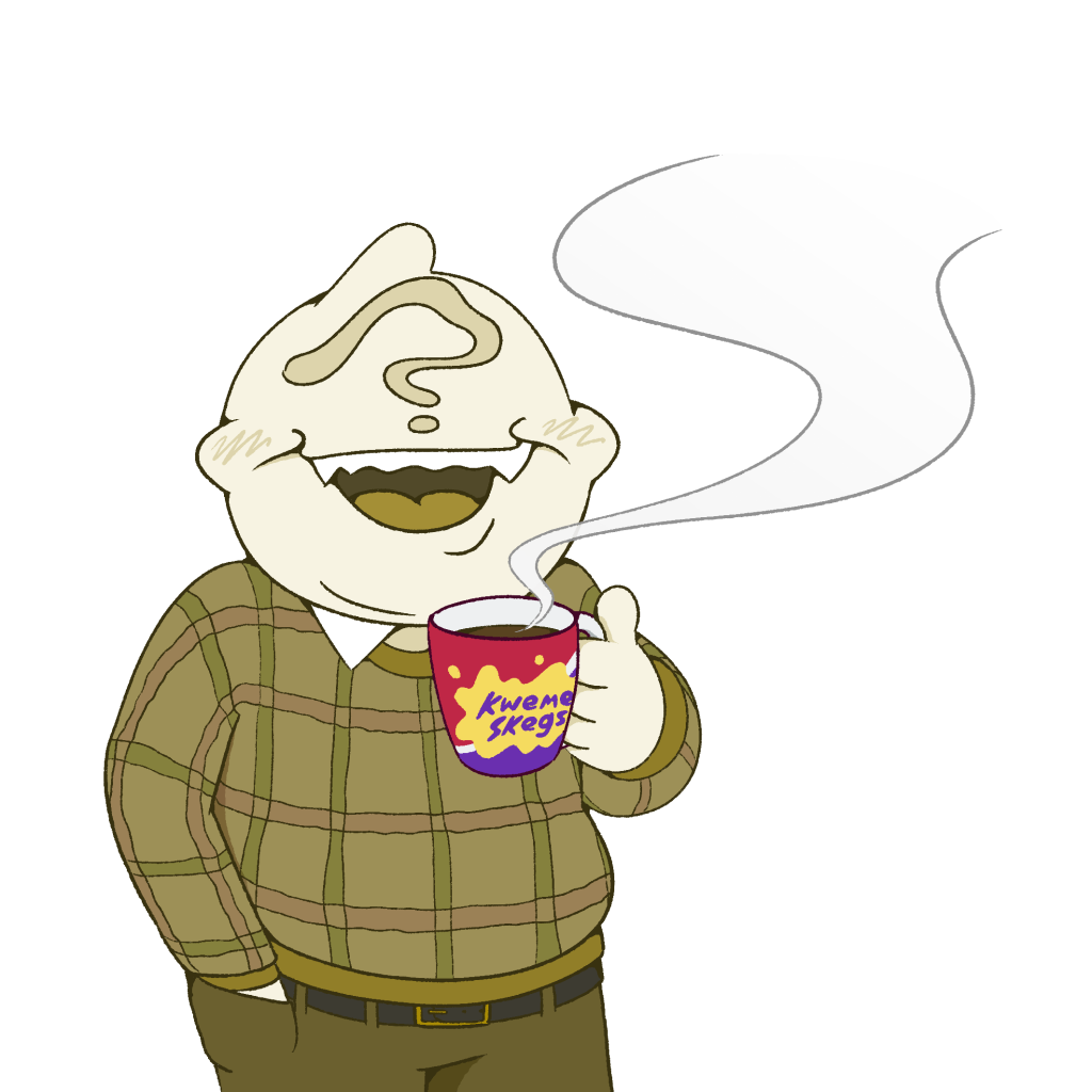
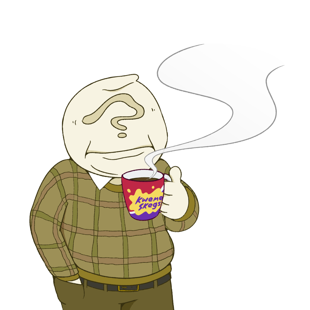

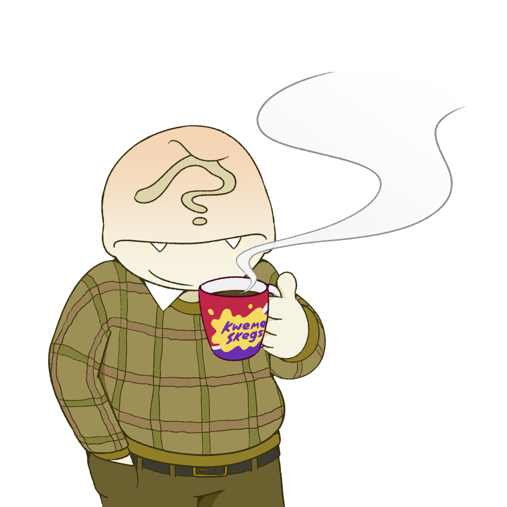

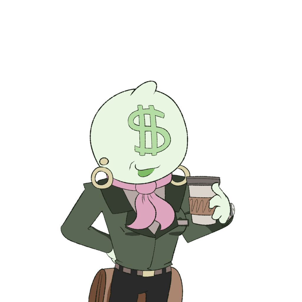
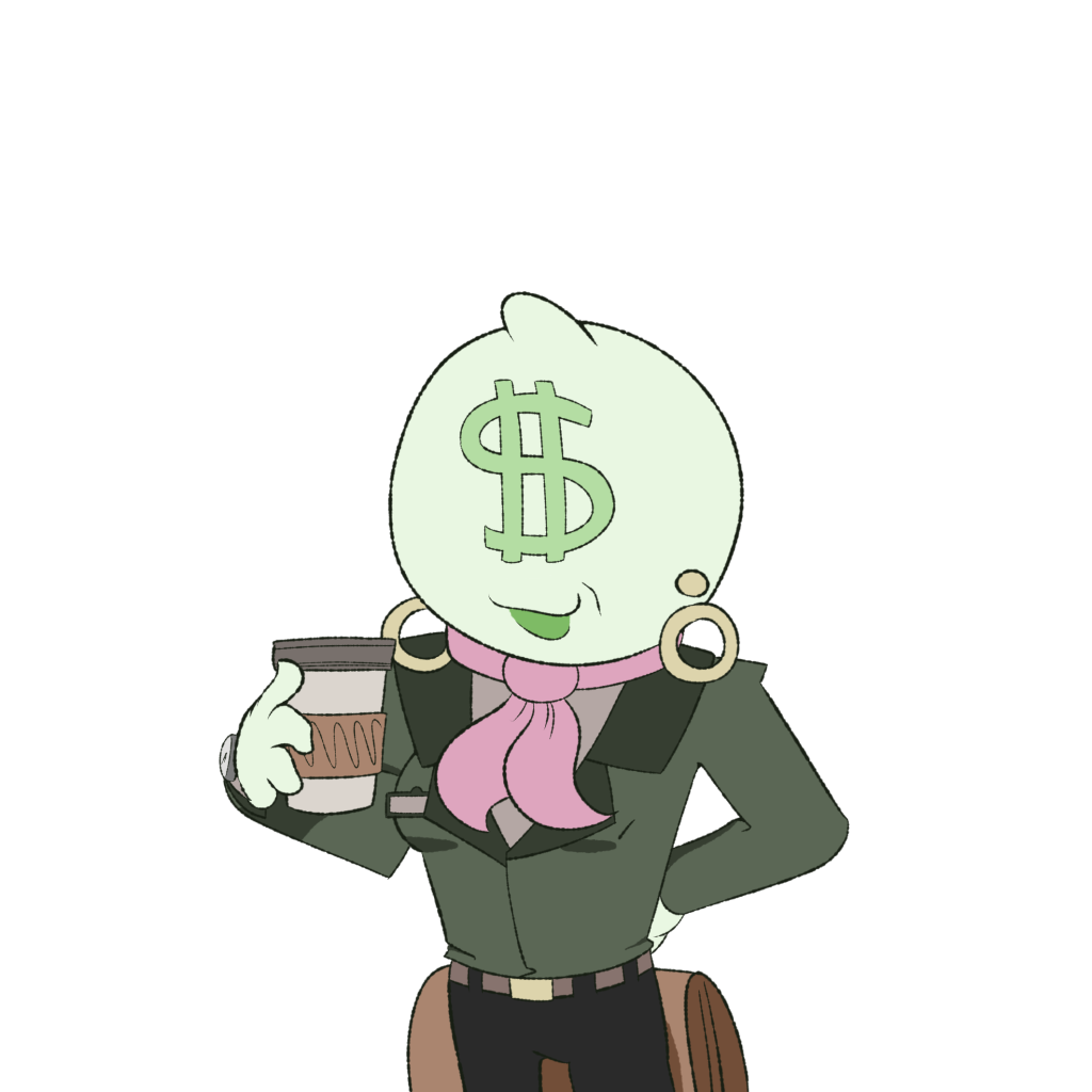
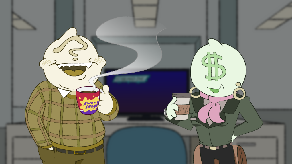
Each character has multiple expressions and an open/closed mouth version of each expression, that are designed to be switched out depending on the scenario, for instance which character is currently speaking or listening, and how they react to one another.
I created these profile illustrations of each team member for use in our final presentation. They were designed to be displayed alongside each corresponding member’s work, in order to help the audience know the team-members better and what each member produced.