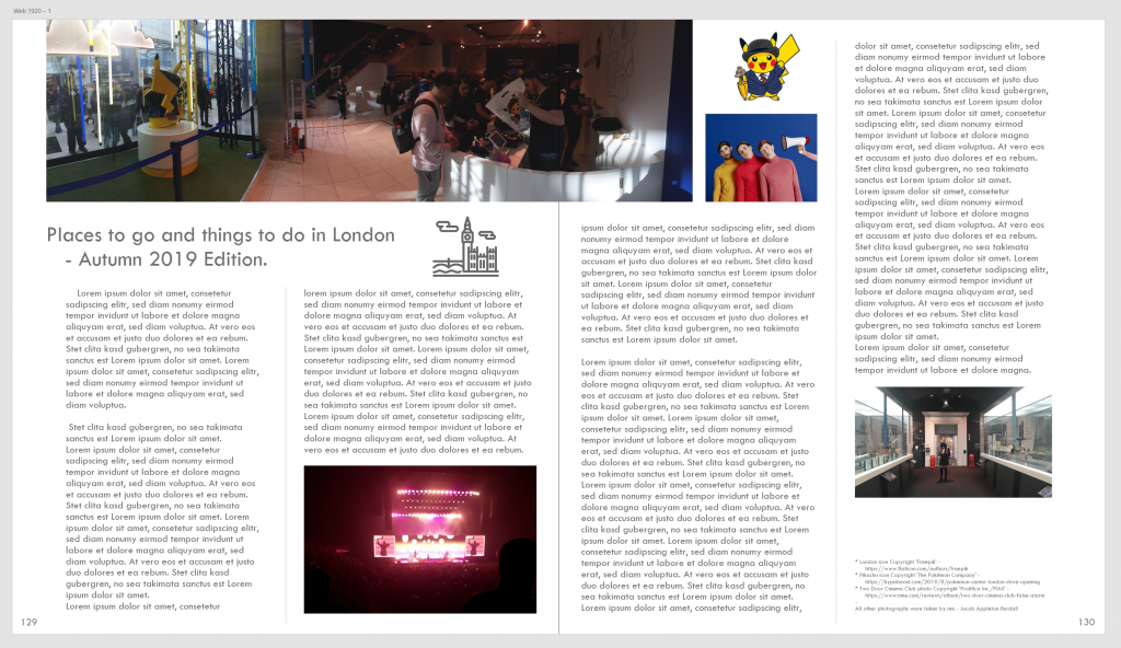
Here, I have used the software Adobe XD in order to create a mockup magazine design that utilises grid layouts and formats. The theme I decided was ‘Places to go and things to do in London – Autumn 2019’, and features primary photographs from a few places I had visited in London during this Autumn (2019), alongside some images from the internet (which have been credited at the bottom right of the page). The text areas have been automatically filled in with Lorem Ipsum in order to show how the text would be situated if designed and printed with actual text.
In order to make my layout visually appealing I needed to find a balance between the assets, where each is evenly distributed to avoid cluttering, equally spaced to show professionalism and so it is appealing to the viewer, and how much space each of them takes on both pages in comparison to the amount of white space so each is easily readable and viewable.
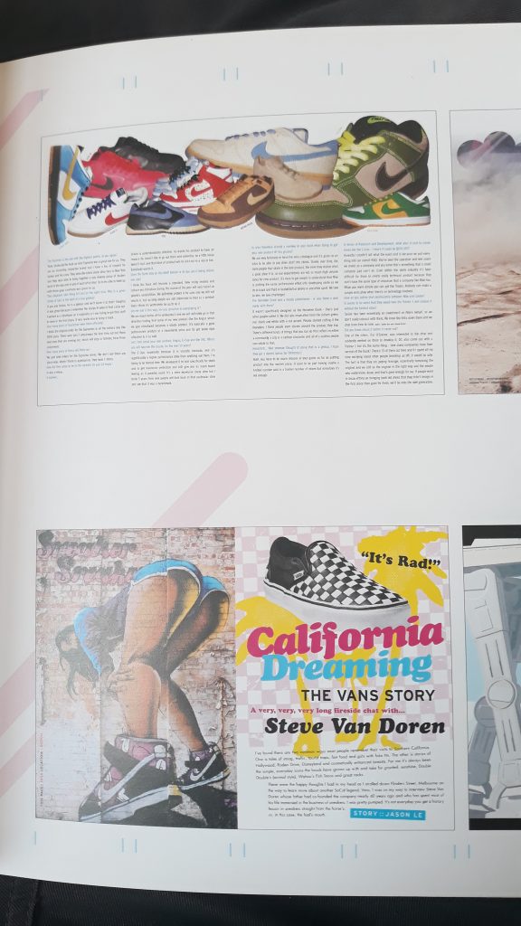
Bellow are a couple of photographs from the book ‘Mag-art’ showing some magazine layouts that inspired me.