Another theory of Tufte is that the use of layering and separation aids the portrayal of visual information. With visual design both on a static art-based and an interactive level, this analytic design theory has been applied in a diverse range of ways. In video games, text and icons are displayed in front of the main visuals, usually being gameplay, cutscenes or still imagery, in order to convey a variety of information and instruct the player.
- Videogames:
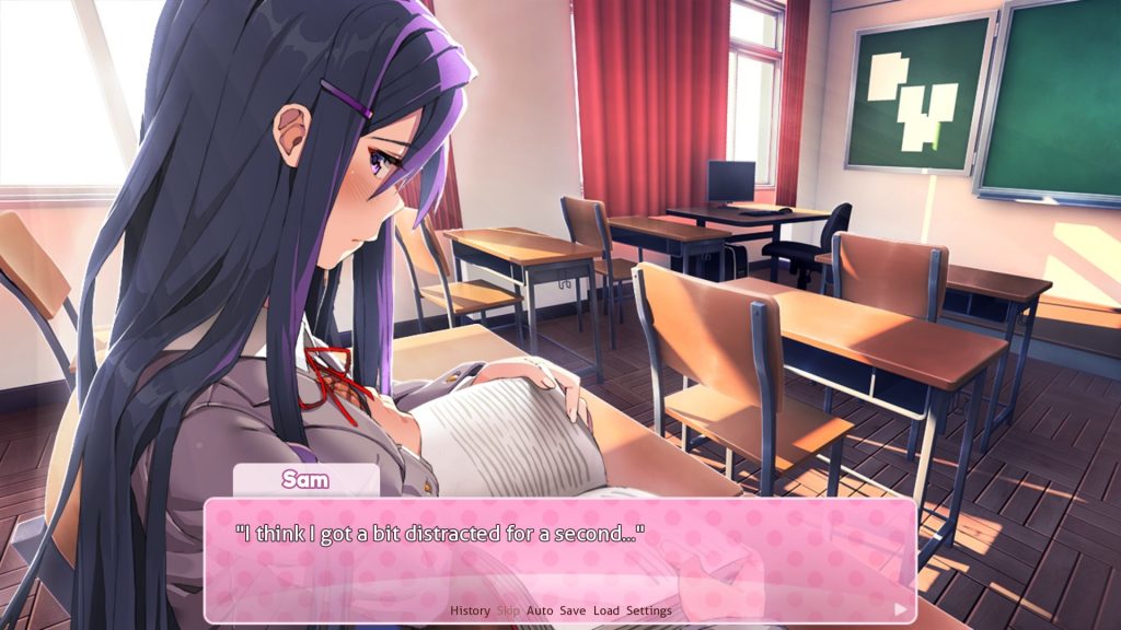
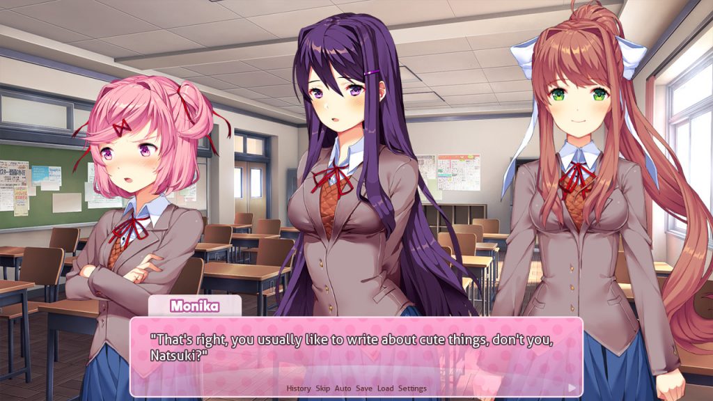
Exampling this theory, the video game ‘Doki Doki Literature Club!’ (pictured above) has the player advance the gameplay and narrative by reading the text/speech box layered above the manga-styled illustrations and clicking the right-facing arrow, which proceeds to the next piece of dialogue. Numerous text-based options are featured along the bottom of this box to give the player control of the gameplay in various ways, mainly being different text options and game settings. In video game jargon this is known as the ‘HUD’ (heads-up display), defining every piece of information that appears above everything else visual in the game to aid the player with its gameplay.
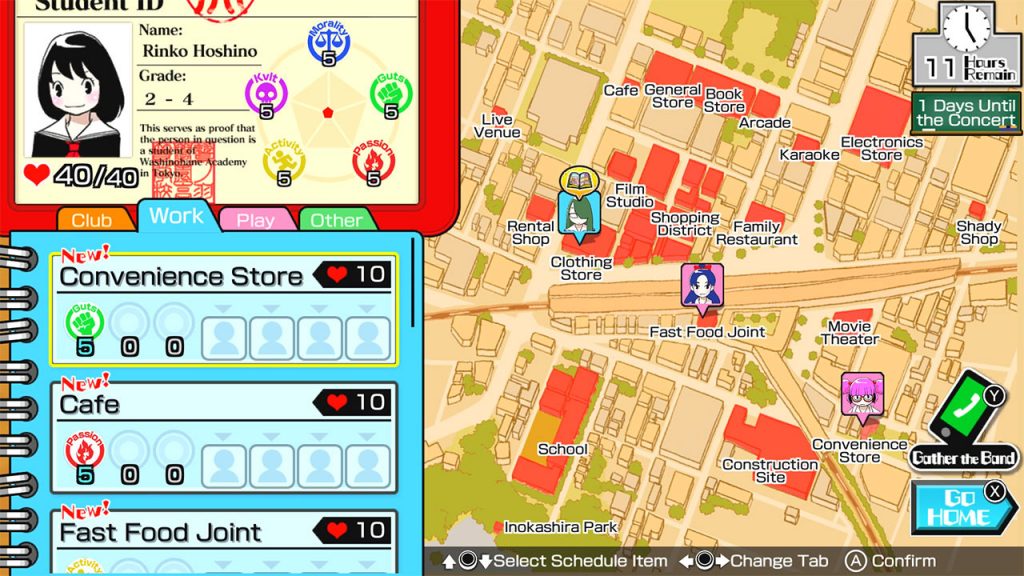
Above is an additional example, the video game ‘Gal-Metal’, that applies colour to Tufte’s theory. Here, a vast variety of text, icons, menus and illustrations are layered over each other numerous times for an intended supplementary purpose – to present the aesthetic of a cluttered student’s journal and social life, which fits the narrative of the game’s story consisting of the main character being a music student attending high-school. Additionally, the use of colour in the menus of this game contribute to the use of layering and separation, where certain hues and tones are used for various graphics to help distinguish certain pieces of information that are different to each other. This is an important addition, as it helps to separate the clutter of the screen and make it easier to understand what it all means, avoiding unnecessary confusion for the player.
- Digital illustration:
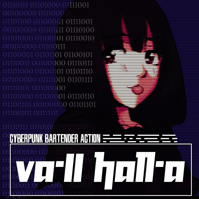
Seen above, a piece of artwork for the videogame ‘va-ll ha11-a: CYBERPUNK BARTENDER ACTION’ is one of my favourite pieces of visual media that utilizes Tufte’s theory. As the title suggests, this game is set in a dystopian cyberpunk future that appropriates retro-futurism aesthetics throughout its visuals and story, and this console menu icon for the game fully illustrates this through its use of layering. A CRT television-like filter and bold, contrasting colours, layered over Pixelated graphics/text and binary code, complete this icon and perfectly encapsulates what this game is by producing something that perfectly fits the intended creative direction.
- Social video-sharing platforms:
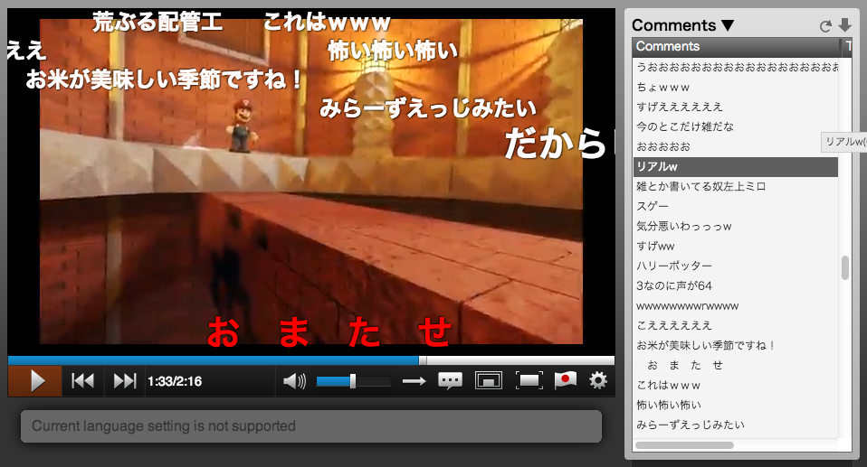
Popular Japanese video-sharing site NicoNico has a unique way of applying the use of layering and separation that appeals to Japanese audiences – comments are displayed and transition sideways over the video at the time in the video the comment was posted to show the viewer what individual people had written about specific points of the video whilst they are watching it. This gives the video a more interactive feel.
- CoroCoro Magazine:
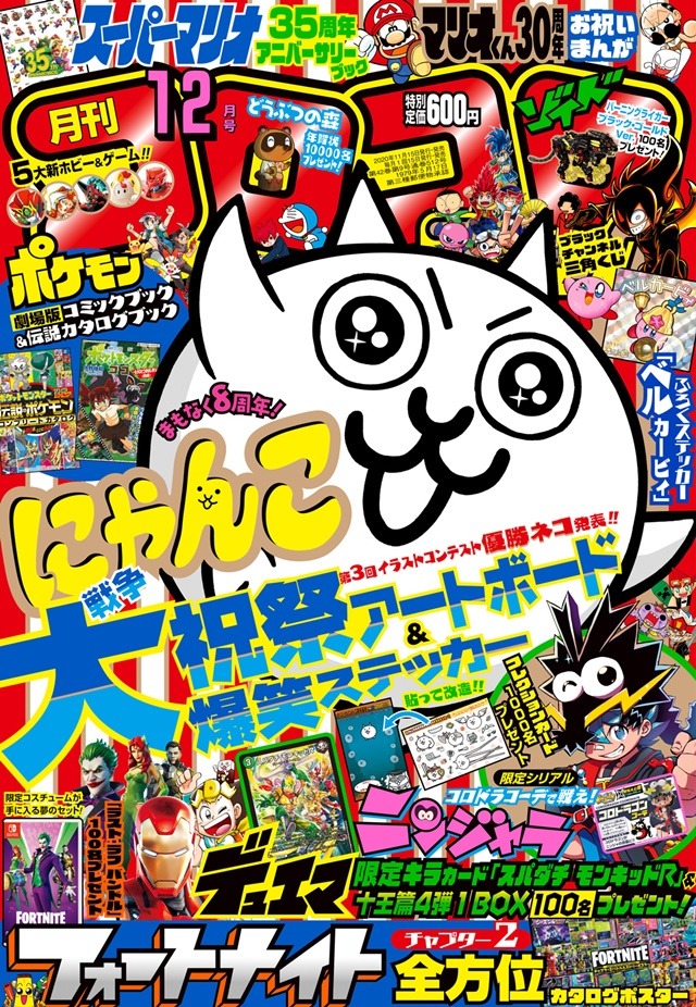
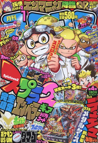
Overuse of layering and separation of information and imagery hinders the chance for visuals to be clearer and more attractive. For instance, I don’t appreciate the front cover designs of the Japanese children’s media magazine ‘CoroCoro’ (pictured below), as they use a severe amount of text, photos, illustrations and clashing colours, all at extremely differing sizes and layered over each other several times. I believe each cover looks way too cluttered to understand the information it aims to convey, and aesthetically it is unappealing. On the other hand, this bright, cluttered and messy cover design is perfect for attracting the intended audience of the magazine, being children who watch cartoons and play video games, reflecting their chaotic and wild personalities. Its style also gives the magazine a very exclusive and fashionable aesthetic, making it iconic in comparison to other publications intended for a similar audience.
If I were to reconstruct the front cover of this magazine I would still prioritize the chaotic nature and aggressive visual presentation, however, I would remove a small number of graphics and text to de-clutter it and highlight more important assets like the title and main/central imagery by giving them a bold white outline, distinguishing and accentuating their importance.
References:
Figure 1: Team Salvato (2017) Doki Doki Literature Club [Video game screenshot]. Available online: https://www.gamereactor.eu/what-did-doki-doki-literature-club-do-so-right/ [Accessed: 13/11/2021]
Figure 2: Team Salvato (2017) Doki Doki Literature Club [Video game screenshot]. Available online: https://www.theverge.com/2017/12/24/16807866/doki-doki-literature-club-dating-sim-horror-short-play [Accessed: 13/11/2021]
Figure 3: Marvelous/XSEED (2018) Gal Metal [Video game screenshot]. Available online: https://www.nintendo.com/games/detail/gal-metal-switch/ [Accessed:13/11/2021]
Figure 4: Sukeban Games (2016) Va-11 Hall-A [Promotional artwork]. Available online: https://www.mobygames.com/game/va-11-hall-a-cyberpunk-bartender-action/cover-art/gameCoverId,562111/ [Accessed: 13/11/2021]
Figure 5: Niconico (Year unknown) (title unknown) [Web video]. Available online: https://thebridge.jp/en/2013/02/niconico-douga [Accessed: 13/11/2021]
Figure 6: CoroCoro (2020) CoroCoro December 2020 Issue [Magazine cover]. Available online: https://otakuusamagazine.com/corocoro-comic-magazines-cover-designer-sets-guinness-world-record/ [Accessed: 13/11/2021]
Figure 7: CoroCoro (2018) CoroCoro January 2018 Issue [Magazine cover]. Available online: https://www.cdjapan.co.jp/product/NEOBK-2172900 [Accessed: 13/11/2021]