My animated logo is for the fictional brand ‘Juwuice’. This brand makes a selection of non-alcoholic and a limited amount of alcoholic beverages targeted at people who indulge in Japanese and internet culture and media, more specifically people who like manga/anime and ‘memes’. The brand would appear at media and entertainment conventions (e.g. comic-con) where many of these types of people attend multiple times a year. The brand and its products are suitable for any gender, background and age, except its alcoholic beverages that aren’t suitable for anyone under the age of 18.
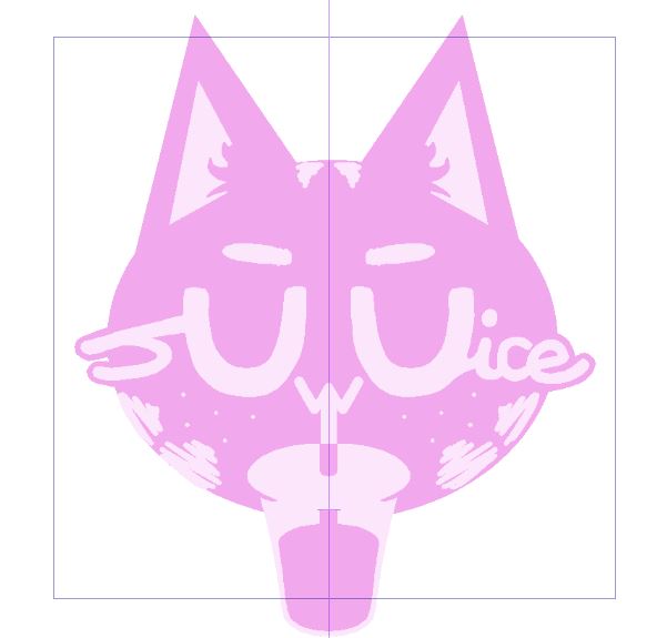
The Juwuice logo consists of a pink cat with the brand name across its face, with the ‘uwu’ part centred and enlarged, as it looks like a happy cat when used as a text-based emoticon. Sitting below there is a cup of juice with a straw – the animated cat slurps up the juice through the straw and raises its eyebrows whilst doing so. Once it has drank all the juice, stars appear at either side of the cat, showing similarly to how it does in manga and anime that the cat is happy and content. These design choices and animated features fit with the identity and purpose of the brand because they perfectly reflect the type of media the target audience indulges in – cuteness, ‘kawaii’ (the Japanese word for cute) and animation.
Animation has enhanced the design of my logo by making it eye-catching and by resonating with the brand’s target audience, who indulge in animated media. Making an eye-catching and fit for purpose logo is the key to making it memorable, and I believe animating it the way I have has achieved this.