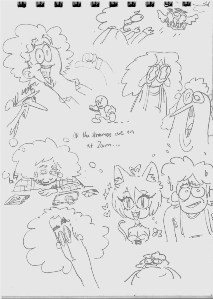
Below are a series of test sketches and illustrations that show the development process of refining the stylised form that represents me. Even though I had not known what specifically I was making my graphic novel about, I did know from around the start that it would feature me in some capacity, so I have had plenty of time practising different styles for drawing myself. I really enjoy drawing myself even though I see myself in a mostly negative light, but I think this may be because by doing so I can understand myself better. As a person who has mostly always kept my issues to myself, having some form of an outlet like this helps, and this will play a part in the final product.
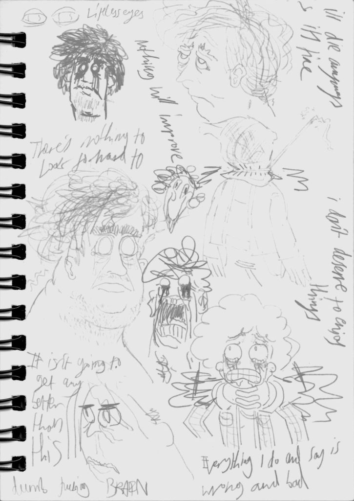
The above pages (figures 2, 3 and 4) were the result of exercising my illustration abilities to practice quickly and loosely drawing myself whilst feeling 3 particularly deep emotions, to figure out how I could express my emotions through illustration, as well as finding a certain illustration style and aesthetic. Figure 2 (left) features happy, calm and ‘default’ versions of myself, Figure 3 (centre) features concerned and tired versions, and Figure 4 features distressed, hopeless and self-loathing versions.
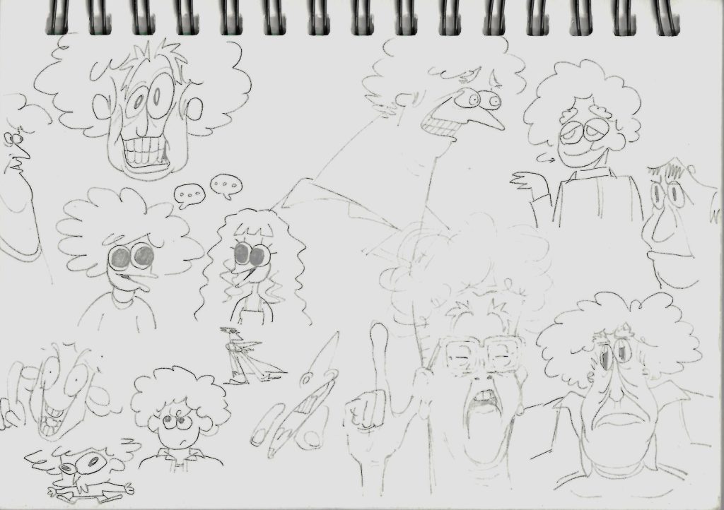
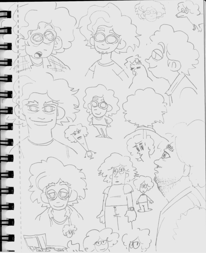
I drew the self-sketches above (Figure 5) in an exaggerated manner to experiment with excessive emotions that are more comedic in nature. These kinds of overwrought styles and expressions may be used when something comedic or eccentric happens but will be fairly limited in use due to the project overall being serious in nature.
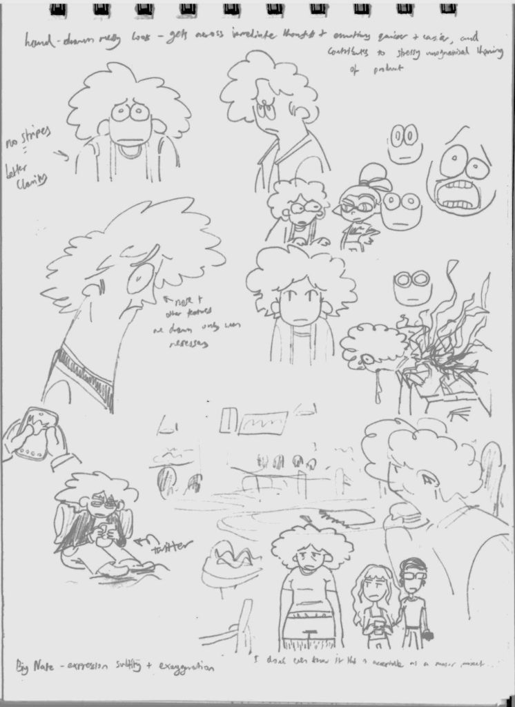
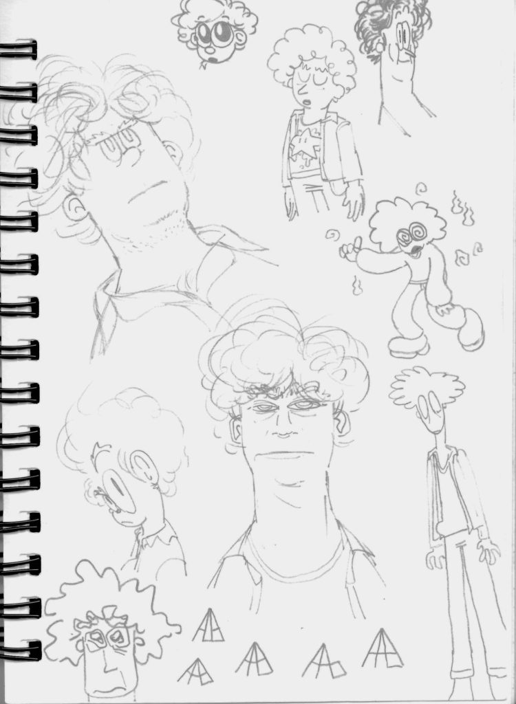
Some of the examples of self-sketches on these pages (figures 6, 7 and 8) are exaggerated as with Figure 5, but the illustrations in Figures 6 and 7 (left and centre) are closer to what the ‘main’ style on the final product will utilise in important scenes.
For scenes in the final product that are not as serious, or when my character is arranged further away, this ‘cartoonier’ style (figure 9) will be used. Due to its simplicity, this style is also good for filling out panels quickly, allowing me to lengthen the page count.
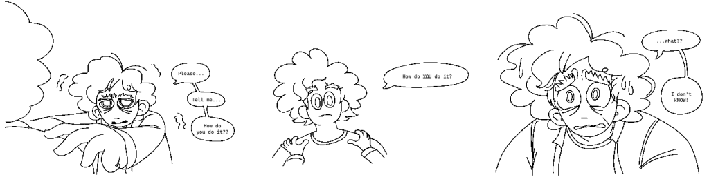
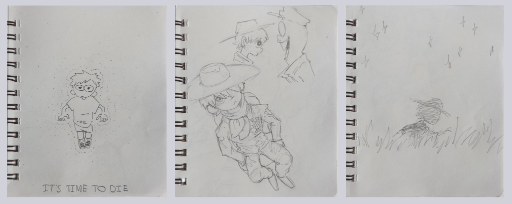
Figure 10 is an illustration that tests a brief narrative through the use of juxtaposed sequential art. It depicts me metaphorically asking myself how I ‘do it’ (cope with life). The final product will be presented in a similar manner, but I would like to add more detail through shading and linework. Overall, this visual style will be used for the majority of the scenes in the final product, and exclusively for scenes that are more serious in tone.

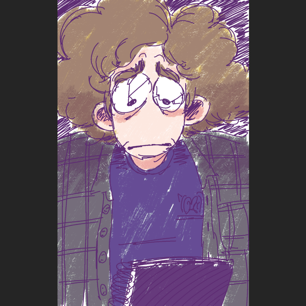
On the two pages above (figures 11 and 12), I did attempt to test colouring, but ultimately it is too long of a process, so colour will be absent from my production. Anyways, the key focus of my project is conveying emotion through the form of illustration in a graphic novel, which does not require colour. I feel that a rushed attempt to utilise colour for representing emotions would bring the quality of the project down, especially since I do not know much about colour theory and its creative applications.