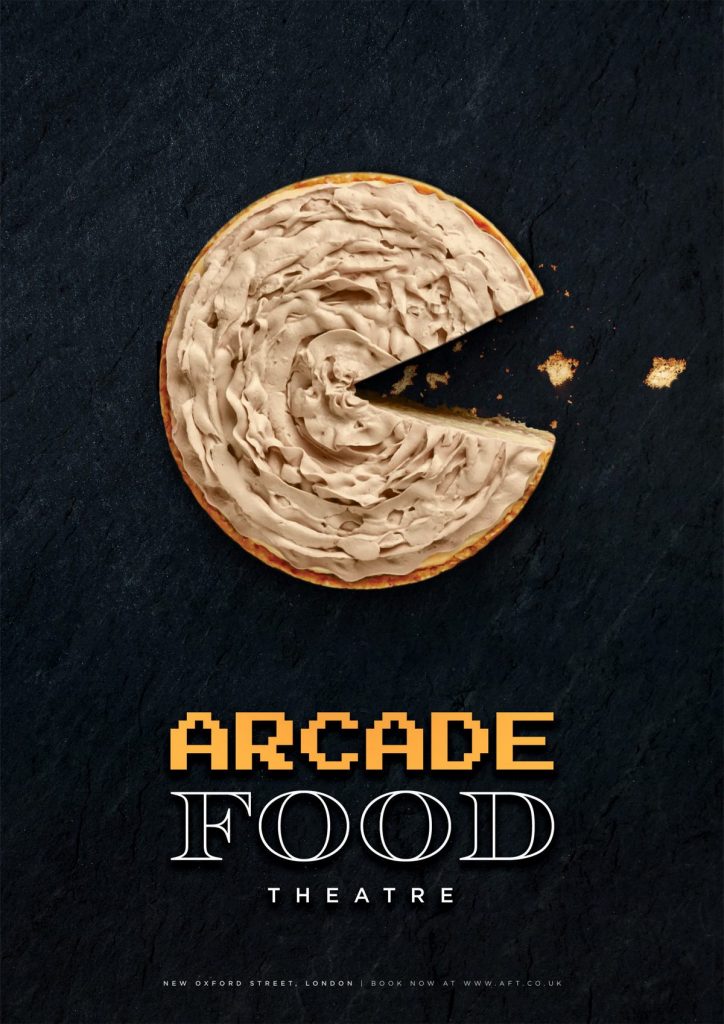
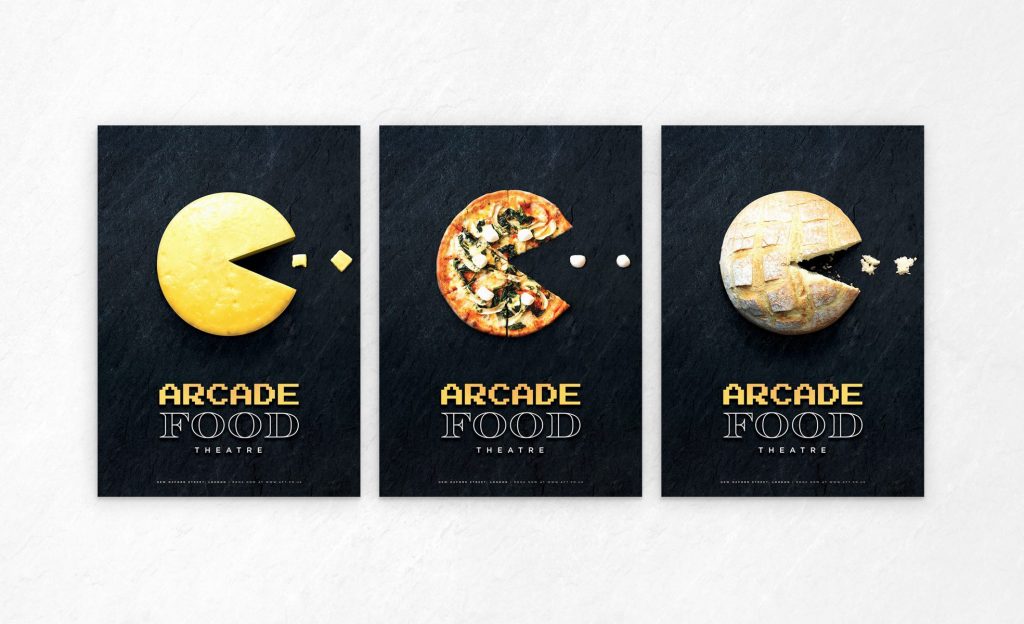
Ben Chamberlain’s collection of posters advertising food and dining at the ‘Arcade Food Theatre’ restaurant in London are conceptual in design, with each aspect of the posters having numerous contextual implications;
- All show a circular food staple with a slice/wedge cut from their sides to resemble the video game character Pac-Man, referencing the ‘Arcade’ part of the name – a pie, a cheese wheel, a pizza and a bread loaf are featured.
- Pieces of each food are scattered in a line to the side of each food, where the slice/wedge is cut from, to resemble the pellets the player controls Pac-Man to eat in the game – pastry crumbs for the pie, cheese cubes for the cheese wheel, mini mozzarella balls for the pizza, and bread crumbs for the loaf of bread.
- Additonally, the little parts of the food make the viewer enticed to eat them – not only because they’re bite-sized chunks that are easy to pick up and pop into your mouth, but also because their alignment to the food looking like Pac-Man eating pellets makes the viewer want to copy what Pac-Man is doing and eat it for themselves.
- Each food resembling Pac-Man has a different size slice/wedge cut from it. Aligning the posters together, it replicates the visual appearance of Pac-Man opening and closing his mouth to eat the pellets like in the video-game.
- Serving as the backdrop of each poster, the black slate has multiple resemblances; a) the surface used to both prepare and serve food in the restaurant, b) the luxury aesthetic and design of premium and high-end establishments, like restaurants and hotels etc., c) the rusticity complimenting the rustic, fresh and handmade foods of the restaurant, and d) the black backdrop of the levels in the Pac-Man video game.
- Two different fonts are used for the text on these posters. The ‘ARCADE’ text is in the same font used in Pac-Man, as well as other video games from the same era (the 70s and 80s), and brings the sense of fun, originality and quirkiness. The ‘FOOD’ text uses a font typical of elegant products and services, bringing to mind the elegance of the restaurant. Both of these together illustrate the feel and design of the restaurant the posters are advertising.
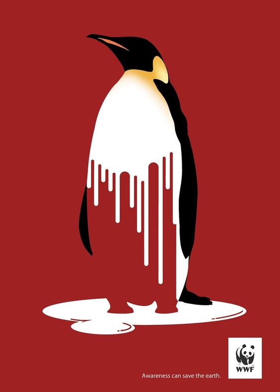
This climate change awareness made by WWF also incorporates conceptual meaning in numerous ways;
- Lines pointing down from the penguin resemble the ice melting and dripping into water down to a puddle (underneath the penguin), with the colour white being used to show it is ice and snow.
- These lines also look visually similar to tall buildings/skyscrapers of cities, which are one of the causes of climate change (from carbon emissions caused by factories, cars and building electricity).
- The puddle the penguin is standing on could instead be interpreted as a very small piece of ice in the water that has mostly melted away due to climate change.
- The orange and yellow of the penguin’s neck resembles the heat melting the ice.
- A deep red background shows the urgency of its message/appeal, but also shows the death of the animals affected, like the penguin, with it being the colour of blood.
References:
- Figures 1, 2, 3 and 4: Ben Chamberlain (2019) Arcade Food Theatre [Digital Illustration]. Norwich University of the Arts, Norwich. Available online: https://worldbranddesign.com/arcade-food-theatre-poster-design-by-ben-chamberlain-norwich-university-of-the-arts/ [Accessed: 23/07/2020]
- Figure 5: WWF (2008) Awareness can save the earth [Digital illustration]. Available online: http://wangyttrium.blogspot.com/2008/11/assignment-6-gestalt-principles.html [Accessed: 23/07/2020]