Detailed below are some key fundamentals that are absolutely necessary for my app revision, with the app needing to be designed around them in order to create a fully working and usable experience for every stakeholder:
- A wide range of services that help the user to stay organised, informed and communicated during their time at the University of Hull.
- All of the original features from the current iHull app needs to be included or reworked.
- One fully integrated and online experience for ease-of-access and handy usability.
- Easy to use visual design, so users can swiftly find exactly what they need to access.
- A wide range of accessibility, customisation and preference options
- Usable to everybody no matter their background, including physical and mental disabilities, genders, ethnicities, language barriers and age groups, including features to aid said people.
- A help and information section, for when a user urgently needs to find information or contact someone within the University of Hull.
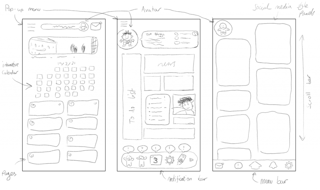
Above are three unique ideas for how the main layout and home menu of the app could be designed. The first one is a very simple and clean design, featuring a menu bar, profile details and a messaging button along the top, along with a useful calendar and buttons for each of the app’s main feature category on the home menu, keeping everything tidy and easy to use. The three buttons along the top could be placed along the bottom instead, so it is easier to select each with your fingers whilst holding your smart device. I do worry that this design may be unengaging though, as there wouldn’t be lots to look at or anything that would stand out to the user.
The second design is inspired by Microsoft’s ‘Live Tiles’ found on the Windows 10 operating system, where each differently shaped and sized button displays an animated, personalised and interactive display within the tile, each showing different information. It again features a pop-up menu at the top-left like the previous design, but a new addition is the notification bar along the bottom that displays small icons that inform the user what is happening in their app, like messages received and hand-in deadlines for instance. Whilst this design would be both immediately informative and visually appealing through the use of instantly recognisable imagery, it may be confusing to use and understand with being presented lots of information at the same time. Additionally, the use of icons along the bottom for the notification bar may be confusing as many cannot read what some icons mean.
The third and final design is inspired by image-based social media, like Instagram, Pinterest and Snapchat, where the user can scroll down to view lots of displayed images of updated information and content, and additionally features a pre-expanded menu bar along the bottom for ease-of-access. This design’s style is very modern, visually appealing and would keep the user informed with the latest news, student blog posts and other information immediately appearing on the home-page. Unfortunately, I believe this design may also make it harder to find and access all of the app’s intuitive features as they wouldn’t be displayed on the home screen, decreasing ease-of-access.
Adding to this, I will need to consider how the app will be presented on different devices. I will primarily design my app in the Android smartphone aspect ratio as it is the most commonly used, since almost all Android smartphones have the same screen dimensions and Android smartphones are very popular, but since I want my app to be used by the widest variety of people possible I would like to design different aspect ratio versions suited to other smart devices. This includes iPhone, tablets and even desktop computers. A web-based version could also be made available for people who do not have enough storage space on their device.
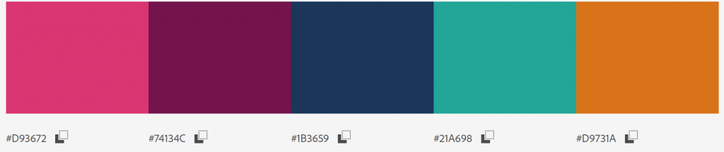
The main colour scheme I want to use for the app is the same main colours used throughout the Hull University app and in my revised app icon design. I believe using the same colours throughout every service associated with the University of Hull will maintain a professional image and aesthetic consistency, enabling these particular colours to be recognised as the University of Hull colours.
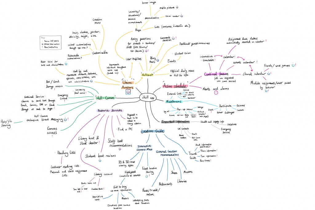
My revised iHull app is a large but streamlined and completely integrated service packed with many different functions, tools and services broken up into categorised sub-sections, to be used by students, lecturers, guests and members of staff alike. Its also designed in an easy to use and understandable fashion for any type of user and everyone in the app’s stakeholders, whilst also sporting a modern and appealing visual style so it is nice to use and maintains the user’s attention. Above is a mindmap I created detailing each of the individual services and functions the app would provide, all categorised into each main app feature. Below I will briefly describe each service
Services:
Home Menu:
The main area that is used to access all of the app’s main features alongside an interactive calendar.
Unimi:
Cartoony and fully customisable avatars that represent yourself and every other user throughout the entire app, baked into every service. A user can design what gender, ethnicity, hairstyle/colour, items of clothing and accessories their Unimi has to fully represent themselves. They can be seen as a user’s profile picture, messaging icon, messaging sticker, blog and review author image and map location icon, as well as on many other services.
Hullcast:
An online service used to write blog posts, chat in forums, ask questions for other app users to answer, read official University of Hull news bulletin posts/announcements and develop a personal profile displaying a user’s posts, shared University work portfolio and other media, as well as access other user’s profiles and the ability to add friends to a friendslist.
Hull-Comm:
A combined communication service that provides direct messaging and file sharing to other users, alongside built-in access to the user’s University of Hull e-mail, canvas account and box-account.
Location Guide:
Used to provide information about the local area, including an interactive campus map with friend location sharing, a travel/transport guide and timetable, directions system and location recommendations.
Participate!:
Access digital events with other users, like quizzes, questionnaires, contests, challenges and Kahoot!.
Action Schedule:
A tool featuring a combined calendar with interactivity, events and user sharing, as well as a notification and alert system.
Resource Services:
View current campus PC availability and library service statuses, along with a university library account, a recommendation/review board and shared reading lists.
Notes +:
Write standard class notes, create shared notes with a class or individual(s), and scan paper documents to save them as images to your device or to detect its text and write it down as a digital note.
Information Centre:
A collection of dropdown bars that display a variety of important information to the user.
Sidebar:
A separate menu to the side that gives the user access to their account, settings, the Unimi creator tool, a list of the user’s current notifications and alerts, and a sign-out button.