To demonstrate Tufte’s theory of the comparison of small multiples, I took inspiration from the Nintendo game series ‘Splatoon’, and the series’ second game’s art book, and attempted to create a series of concepts for hyper-stylised and thematically felicitous icons and symbols to appear throughout my game’s Heads-Up-Display, with each having a purpose. I compiled these together against a background to use as my second graphic. Their purpose is to appear clearly and consistently throughout the gameplay experience, informing the player directly and instantly to prevent frustration and time wastage that may cause a hindrance to the player experience. The harder it is for the player to read any information presented on the screen, the longer it takes to develop an understanding of what tasks need to be completed, resulting in less time spent actually playing the game. Game developers want to prevent players from experiencing these two circumstances as it can result in the product being received poorly, which has the potential to harm its identity and sales figures drastically.
My creative campaign’s second graphic consists of a variety of various icons and symbols designed to be featured in the game’s User Interface and/or Heads-Up Display. Below I have listed the in-game purpose of each icon. Please right-click on the image below and select ‘Open image in new tab’ to view it larger/fully.
Life/health icons:
– Top row, left – Protagonist Ash’s head, blocked in with their design’s signature colour lime green.
– Top row, right – Three identical hearts also coloured similarly.
– Second row – Stacked variants with an ‘X3’ beside them to show the player has three lives.
Consumable items:
– Third row – ‘Bappie’ burger and ‘Kweemie’ sundae: consumable items that give the player extra health.
– Third row – ‘Kapattie’ burger and ‘Squeemie’ sundae: variants that give the player more health than their regular versions, as well as magical abilities.
Character customisation:
– Fourth row – Character customisation page section icons, one for tops, one for footwear, one for handwear and one for bottoms, designed to be selected to bring up a catalogue of clothing items that fit into each category.
User Interface specific commands:
– Bottom row – Back button, Select button, and currency counter.
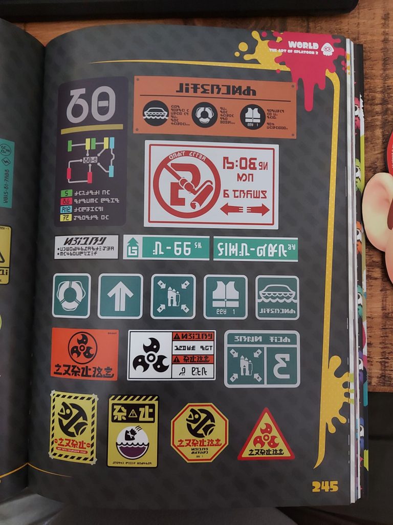
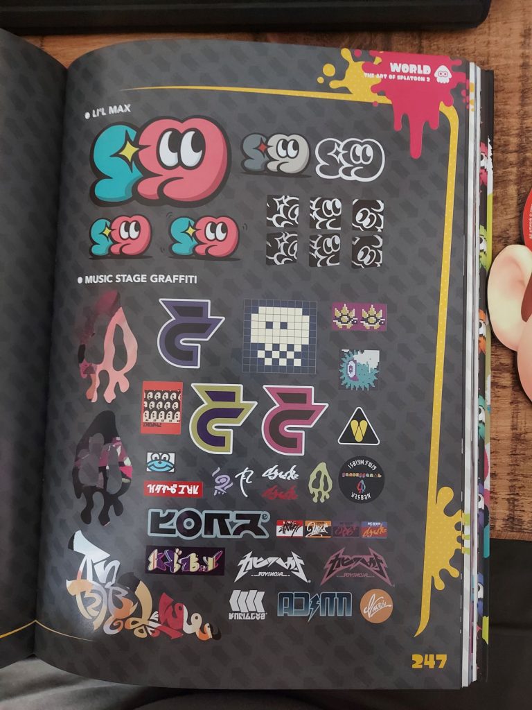
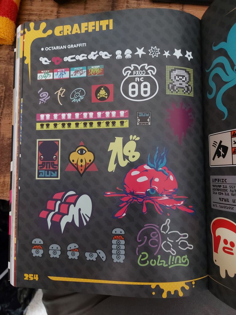
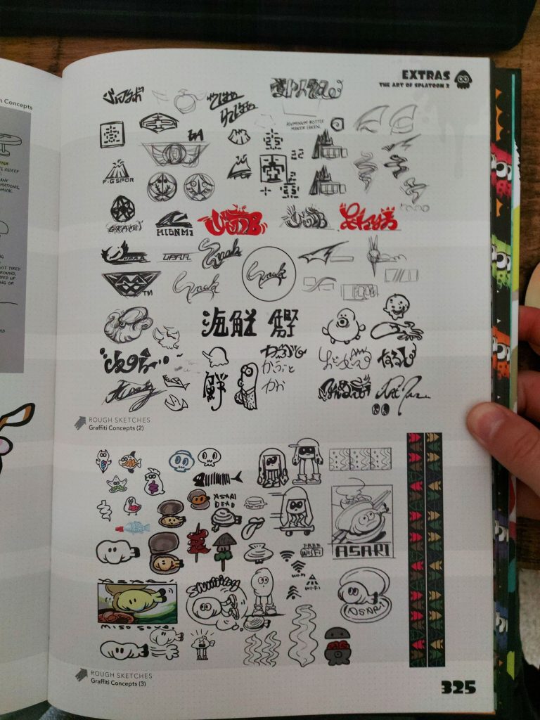
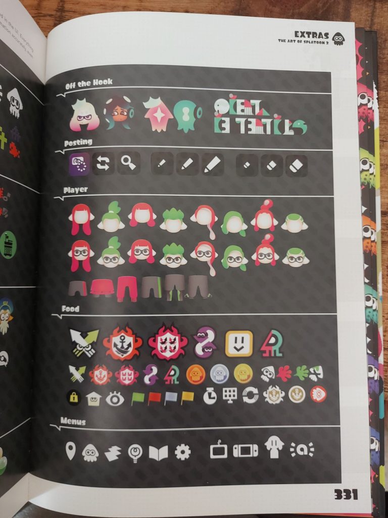
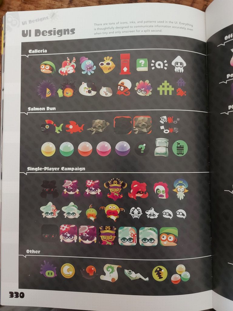
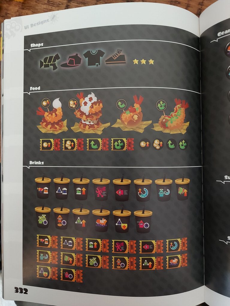
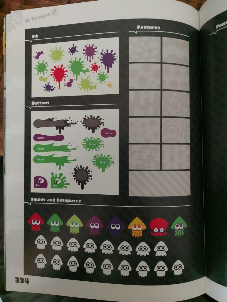
Figures 2, 3, 4, 5, 6, 7, 8 and 9 – Pages from ‘The Art of Splatoon 2’ (Dark Horse, 2019).
Above are photographs I have taken of specific pages from my copy of the video game ‘Splatoon 2’s art book that greatly inspired my work in this creative campaign, and more specifically my graphic above. With this game series being a personal favourite of mine, the Splatoon development team have exquisitely designed assets that convey a sublime amount of originality, and massively contribute to the stylised aesthetic of the game whilst also perfectly and clearly conveying their intended purpose to the player. I strive to have this level of pure design perfection in my own work.
References:
Figures 2, 3, 4, 5, 6, 7, 8 and 9 – Dark Horse. The Art of Splatoon 2 (2019), (245, 247, 254, 325, 330, 331, 332, 334).